RAVIN
YEAR
2021
CLIENT
Ravin
ROLE
Lead Product Designer - US
TASK
Build both a mobile app (vehicle inspection tool) and a web app (scan/data analysis tool). Create and manage / maintain design systems for clients: Lexus/Toyota US, Mercedes-Benz UK, Volvo UK, KBC Bulgaria. Set up and run user interviews to find pathways forward for the design team.
PROJECT DESCRIPTON
Ravin uses computer vision and deep learning to detect and monitor vehicle condition leveraging mobile phones and standard CCTV cameras. Ravin was needing a product designer to take lead of the new US clients and I was brought on. Responsible for the creation of three mobile applications (UI/UX as well as design system creation, maintenance), and the UI/UX of Ravin's back-end scan analysis tool (Ravin Eye). Worked remotely with two other designers from the UK, a product manager from Spain, developers in the UK and data scientists from Israel. Responsible for the creation of internal company tool (Ravin Eye). Conducted internal and external user interviews to find areas of frustration/improvement for both our internal and external products. Worked alongside Toyota's factory team, running 2 week sprints at a time. Each handoff required a fully functional clickable prototype with animation timings/transitions and requirements for developers for implementation. Took weekly trips to auto auction houses/auction yards, dealerships to use our mobile app to conduct vehicle scans to see first hand how our product worked. Used Figma and Miro to design/collaborate. Used Slack, Zoom, Microsoft Teams for communication.
Successfully soft-launched our mobile vehicle inspection app into 50 Lexus/Toyota stores in the US, and 38 Mercedes-Benz dealerships in the UK in 2021. Now, fully launching to many more dealerships/locations in 2022.
ravin.ai/tools
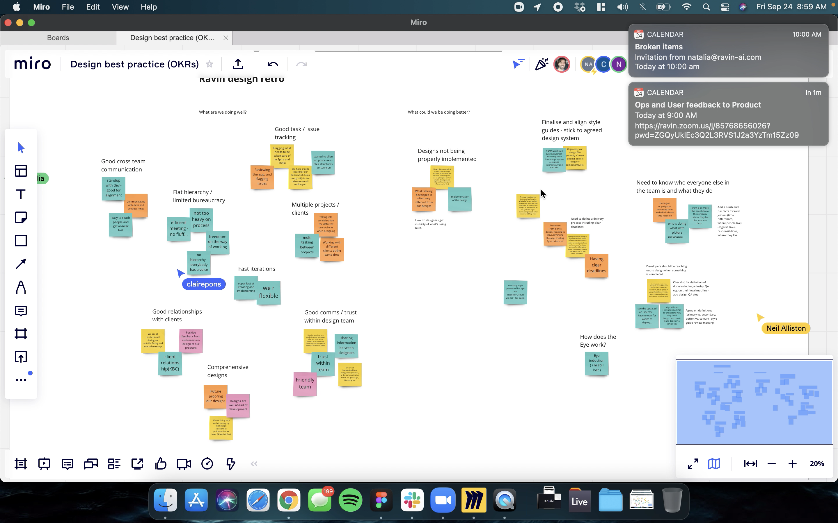
We collaborated to discuss and define our OKRs using Miro. This allowed us to gather input from various team members efficiently, ensuring everyone’s voice was heard. It facilitated a clear and organized approach to setting our objectives and key results, helping us align on actionable goals and ensuring that all team members were on the same page.
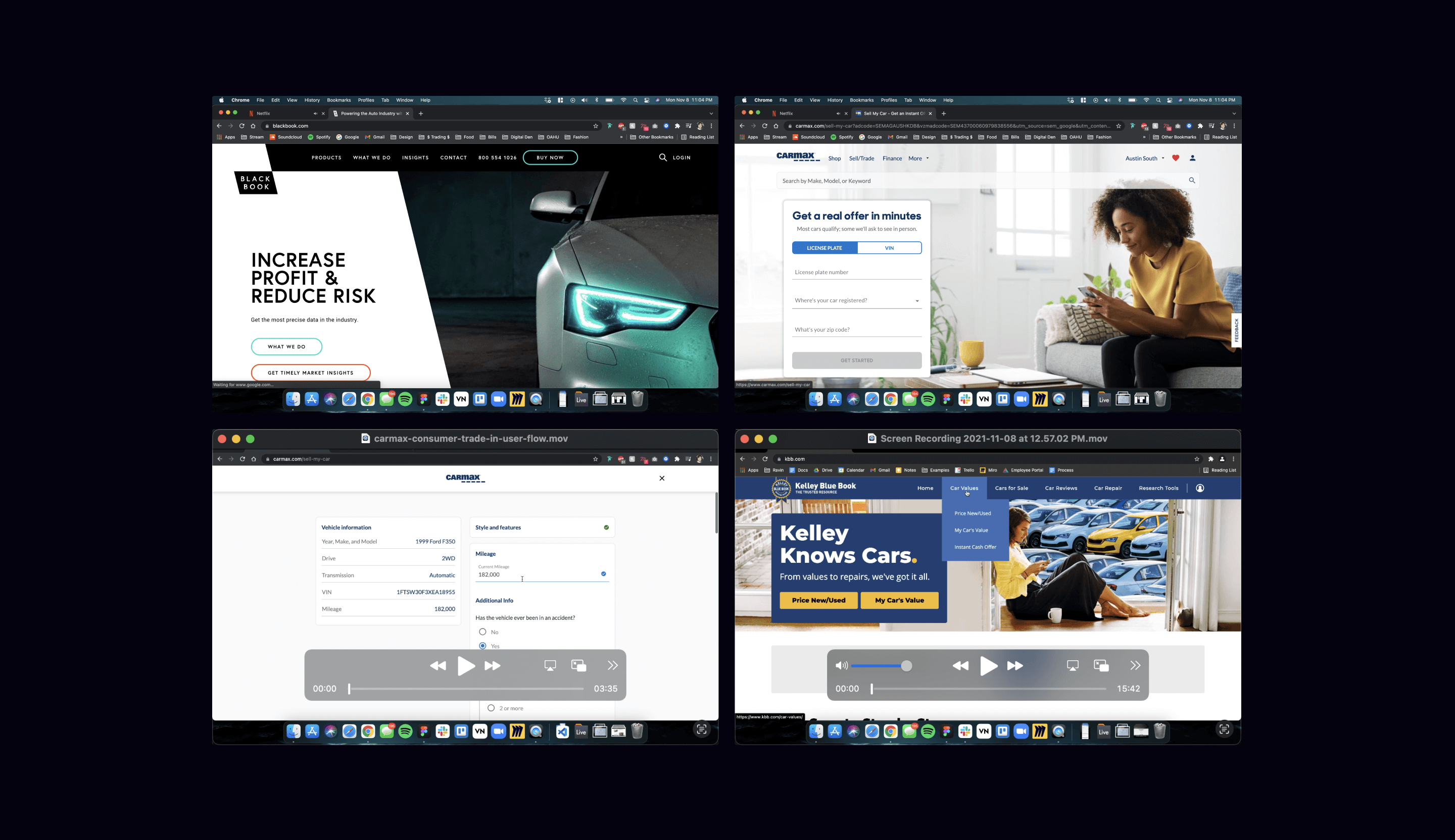
We ran discovery sessions to conduct a competitive analysis, creating videos that examined our competitors' trade-in processes. These videos focused on the duration, available options, and user pain points. This analysis allowed us to directly compare our flow with those of our competitors. By identifying and understanding the strengths and weaknesses in other trade-in processes, we were able to streamline our own, enhance the user experience, and provide a more efficient and user-friendly solution.
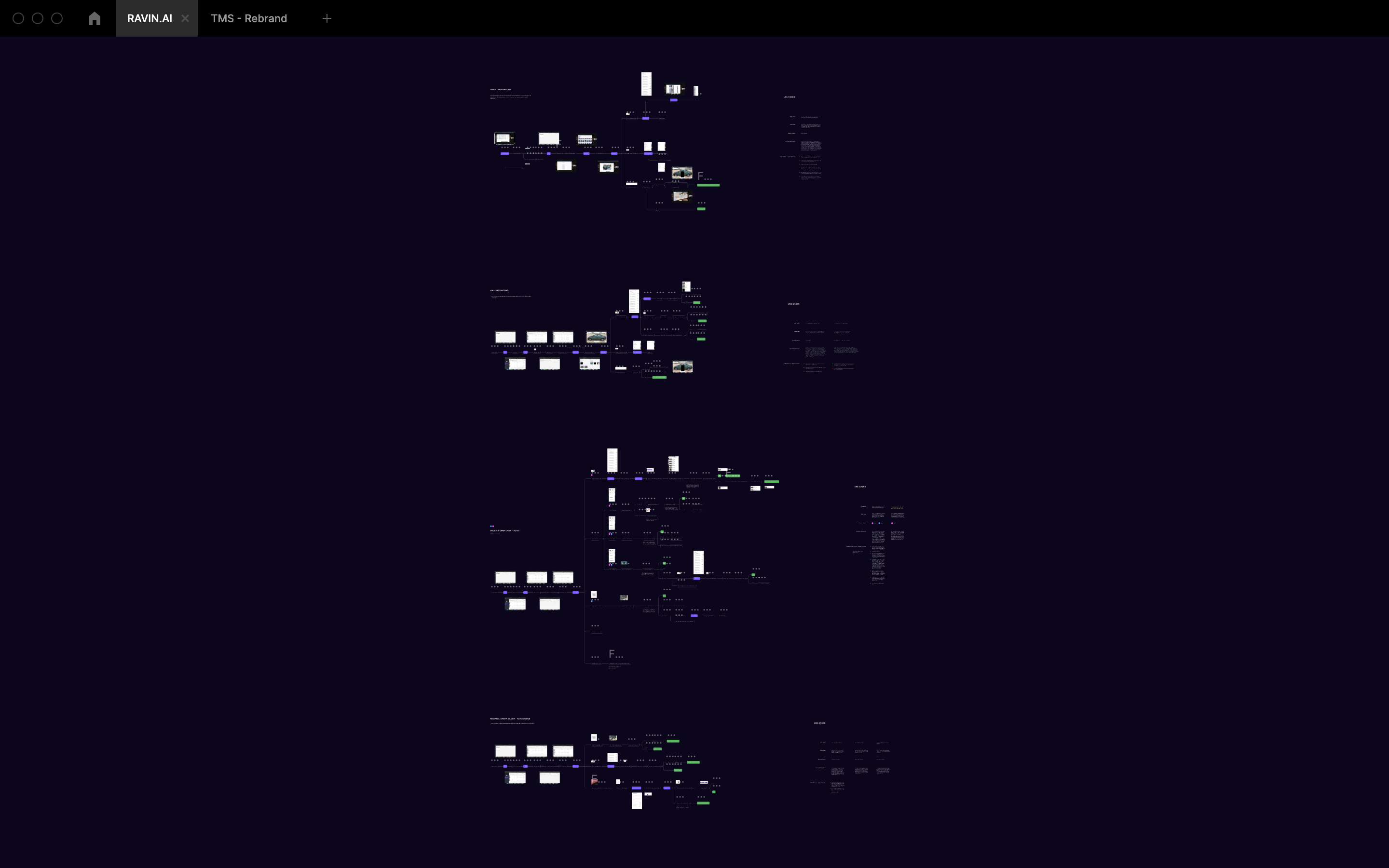
We ran user interviews both internal / external to create user flows to understand pain points and frustrations as well as areas of value. From this we gained a better understanding of how our user were actually interacting with our product.
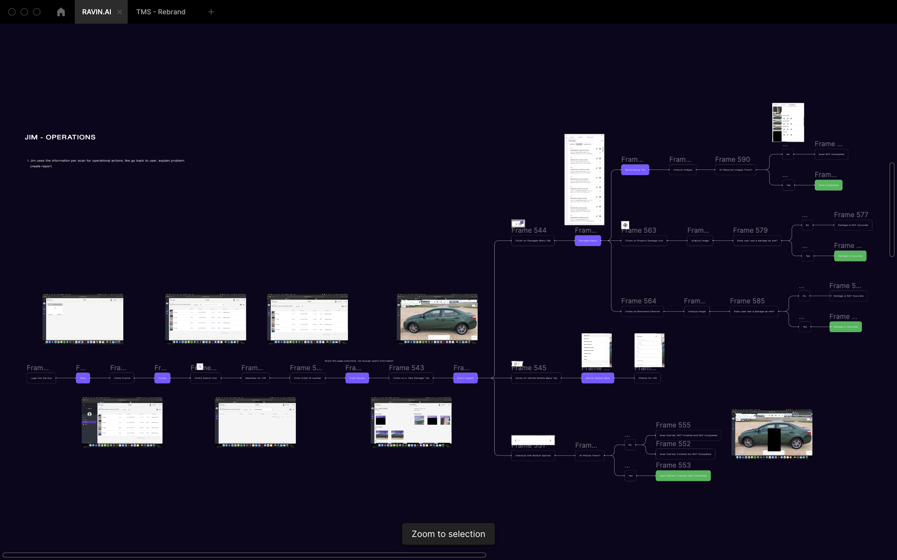
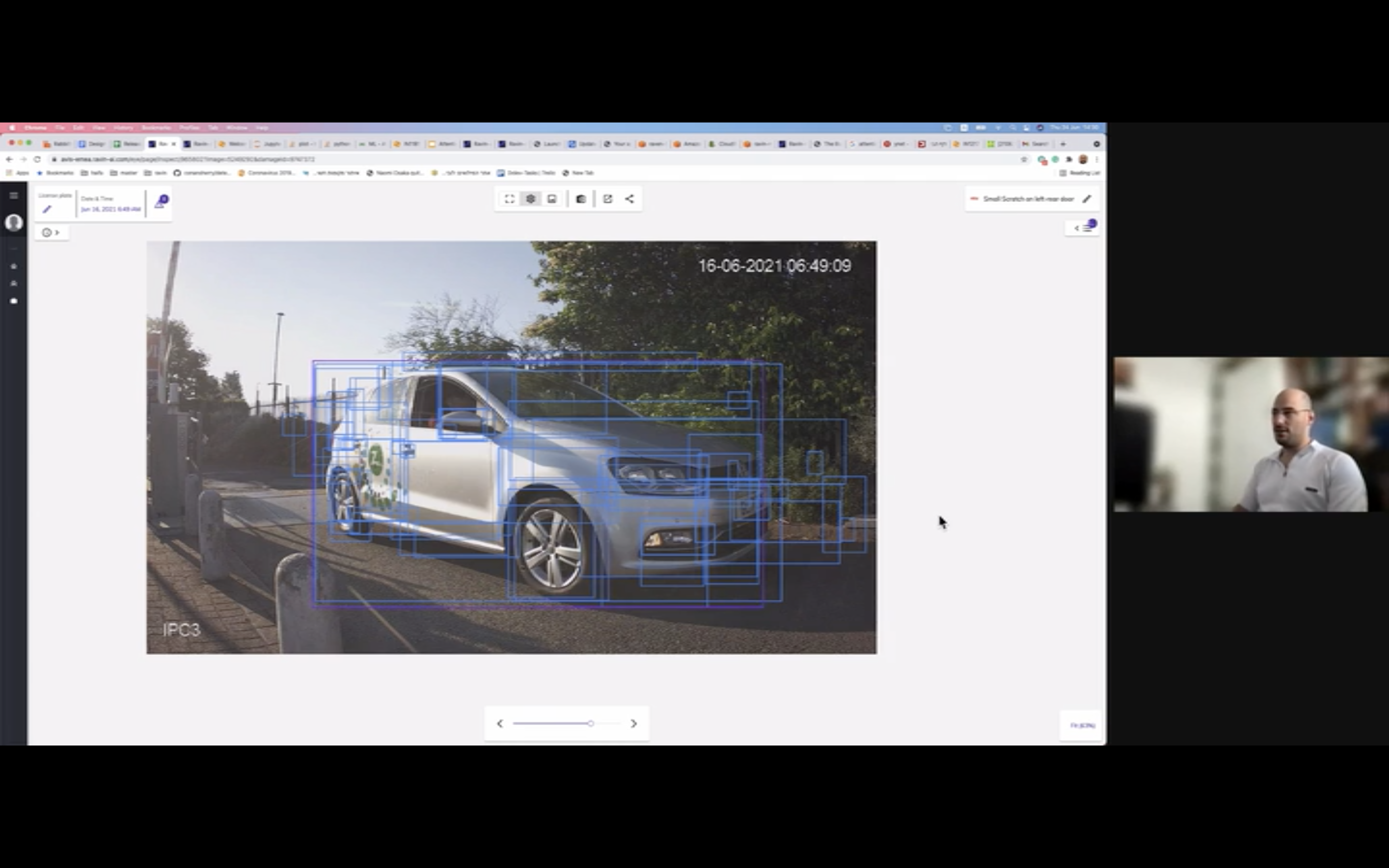
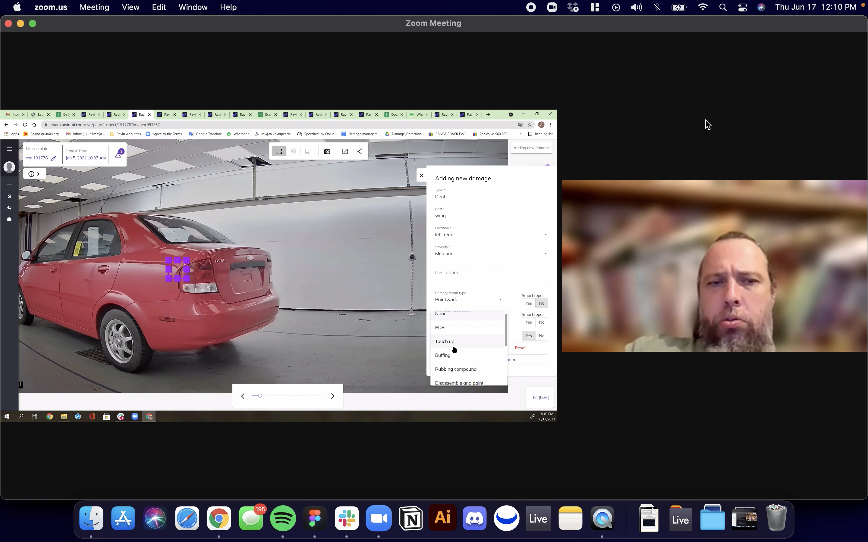
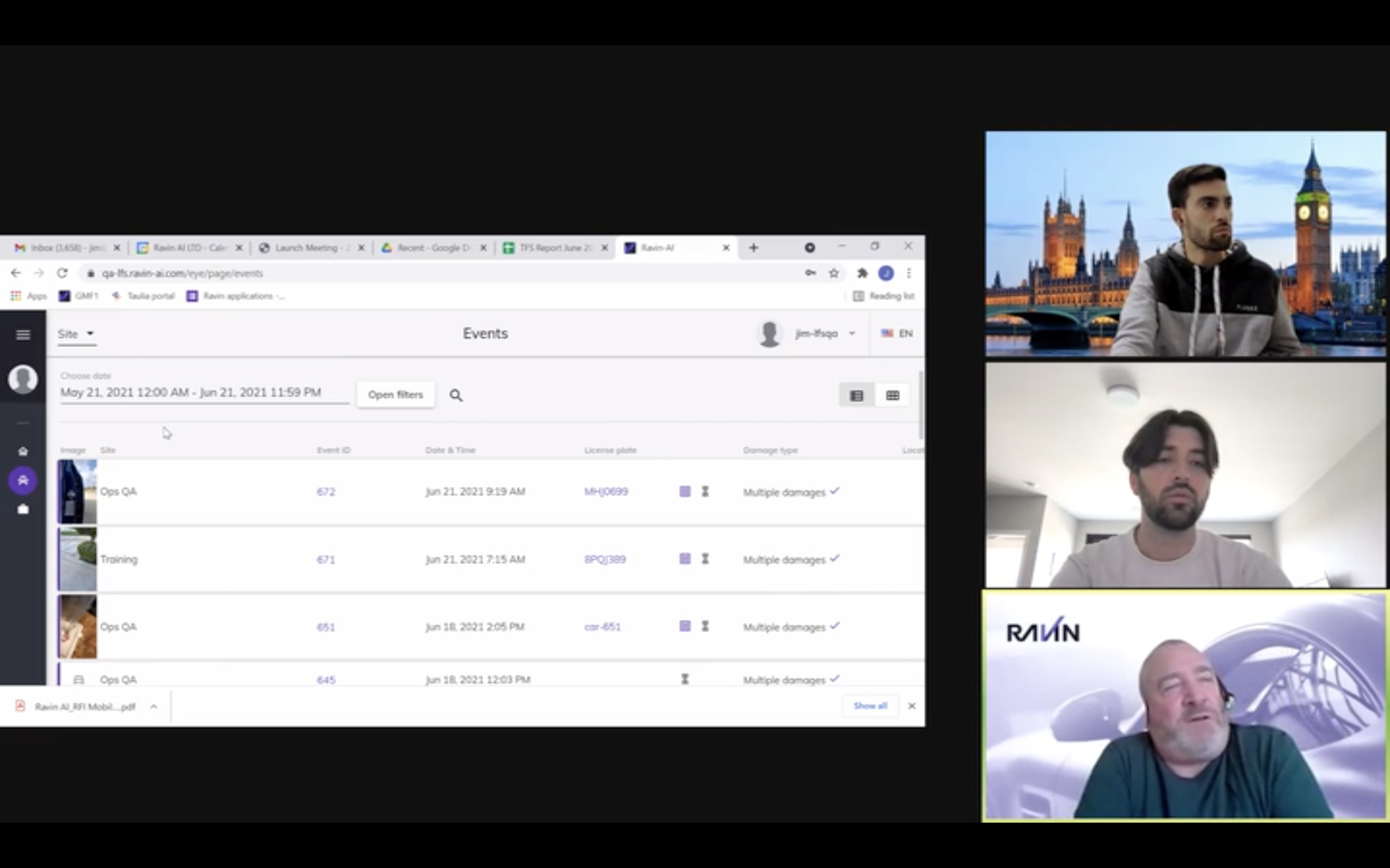
We ran discovery sessions with various internal teams to better understand how they interacted with our back-end tool, RavinEye.
We found that teams were wasting a lot of time switching between RavinEye and Slack for updates, which led to significant delays and potential errors. To solve this, we integrated a real-time pinging system within RavinEye, which reduced the average wait time for a response from 4 hours to just 2 minutes.
Although we didn't get to test the error rate metric, we believe it would have shown significant improvement as well. Due to an NDA, I can't share the specific designs of the pinging system, but I can discuss the process and overall impact.
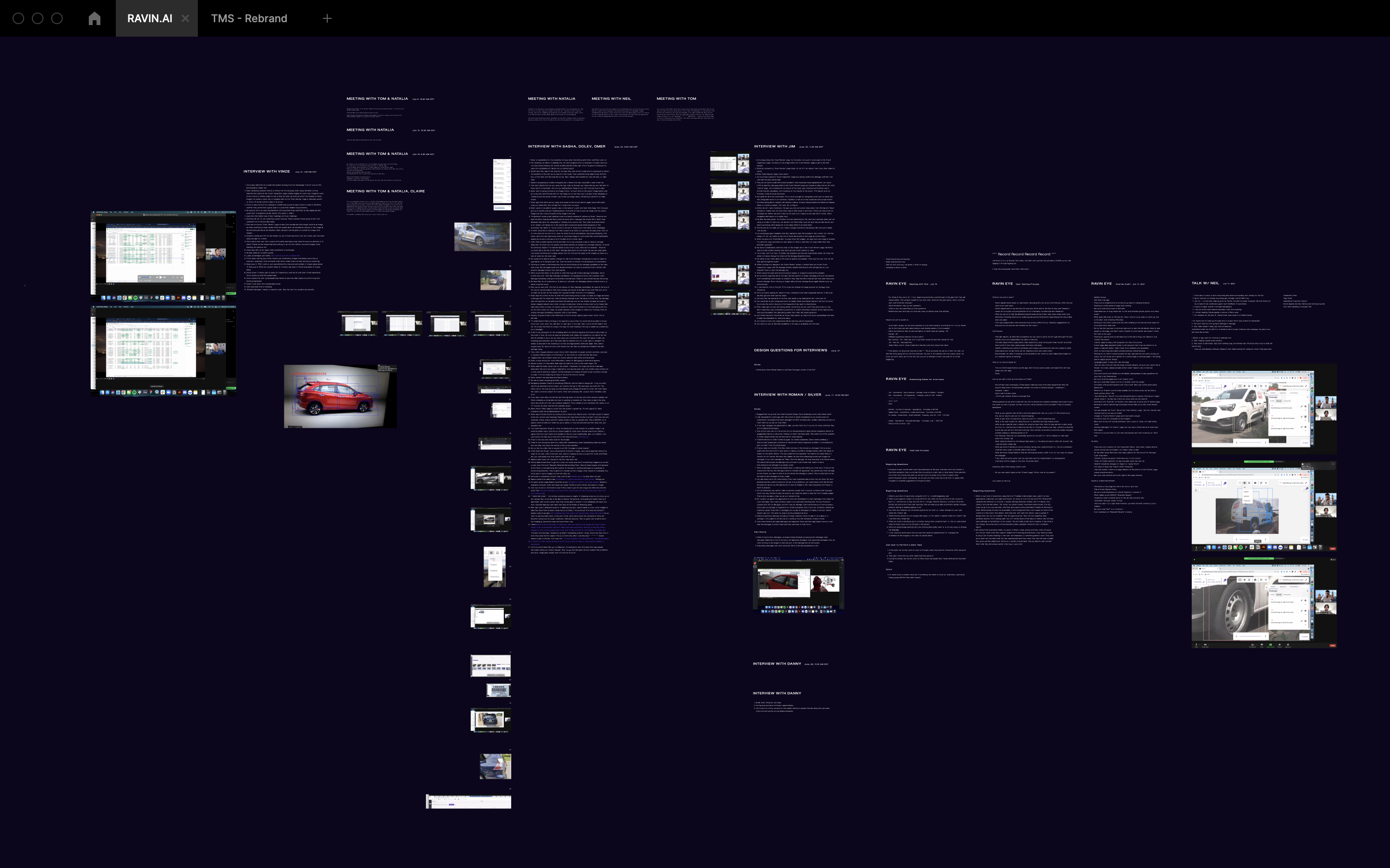
We created an extensive design system for our primary mobile vehicle inspection app
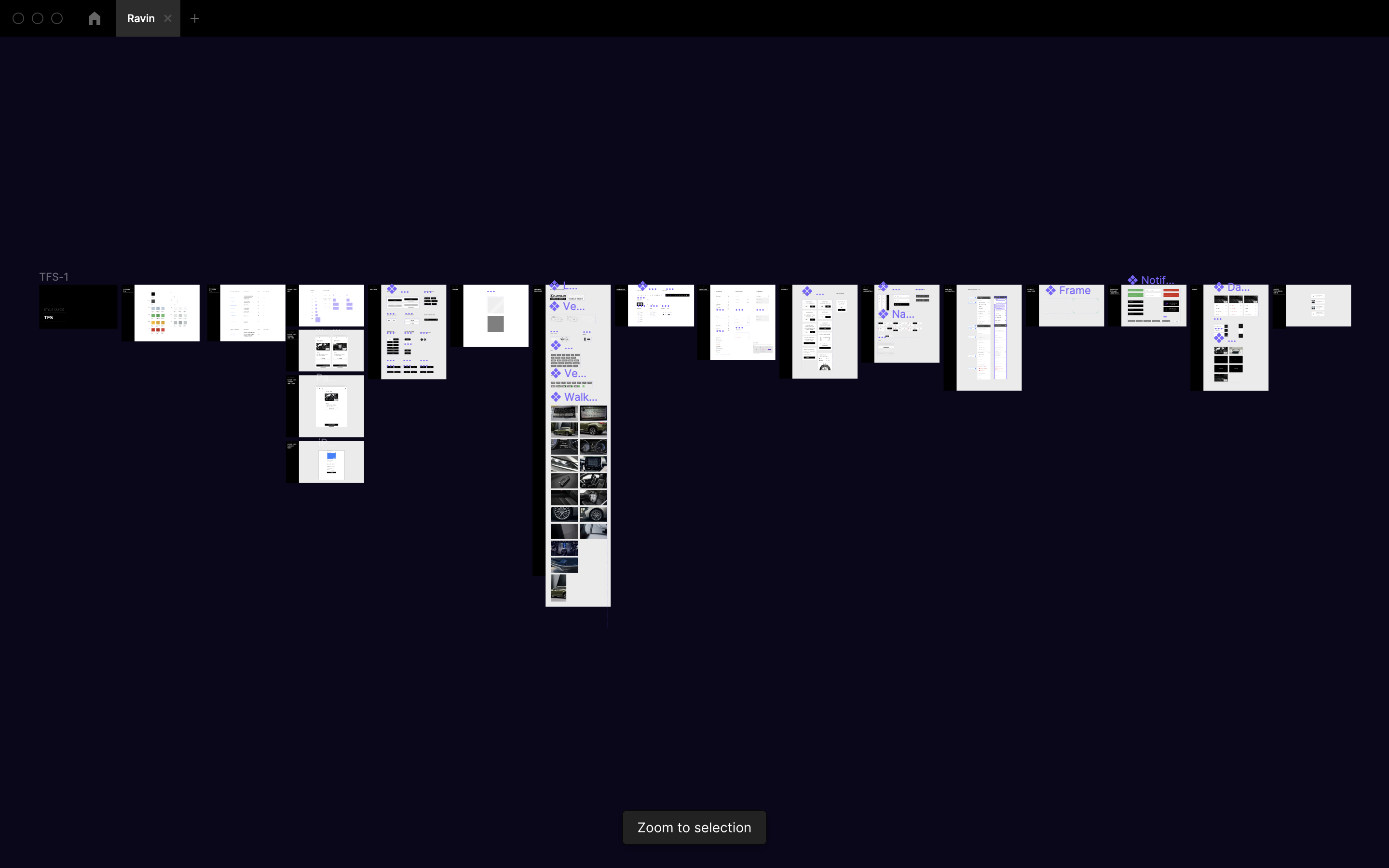
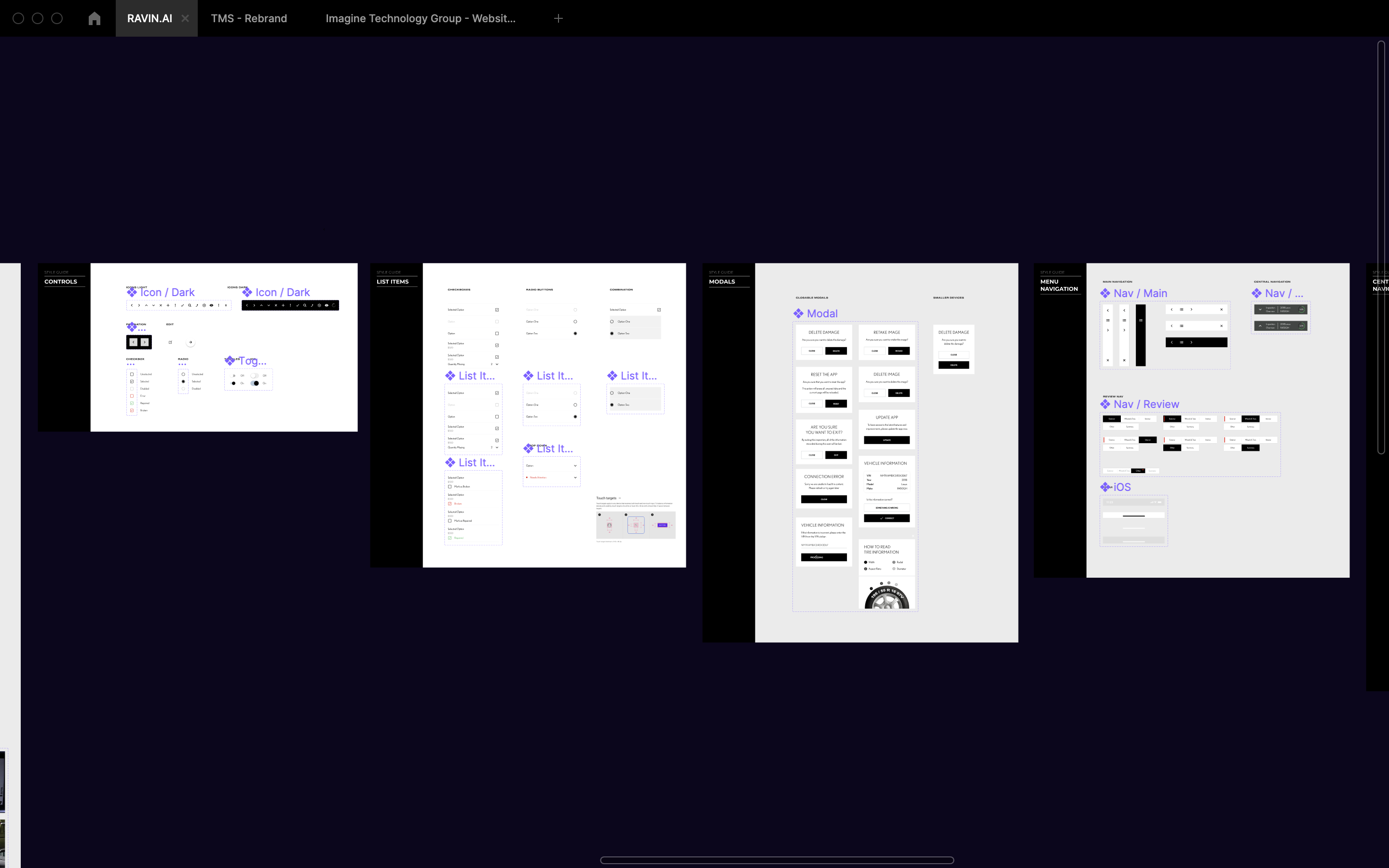
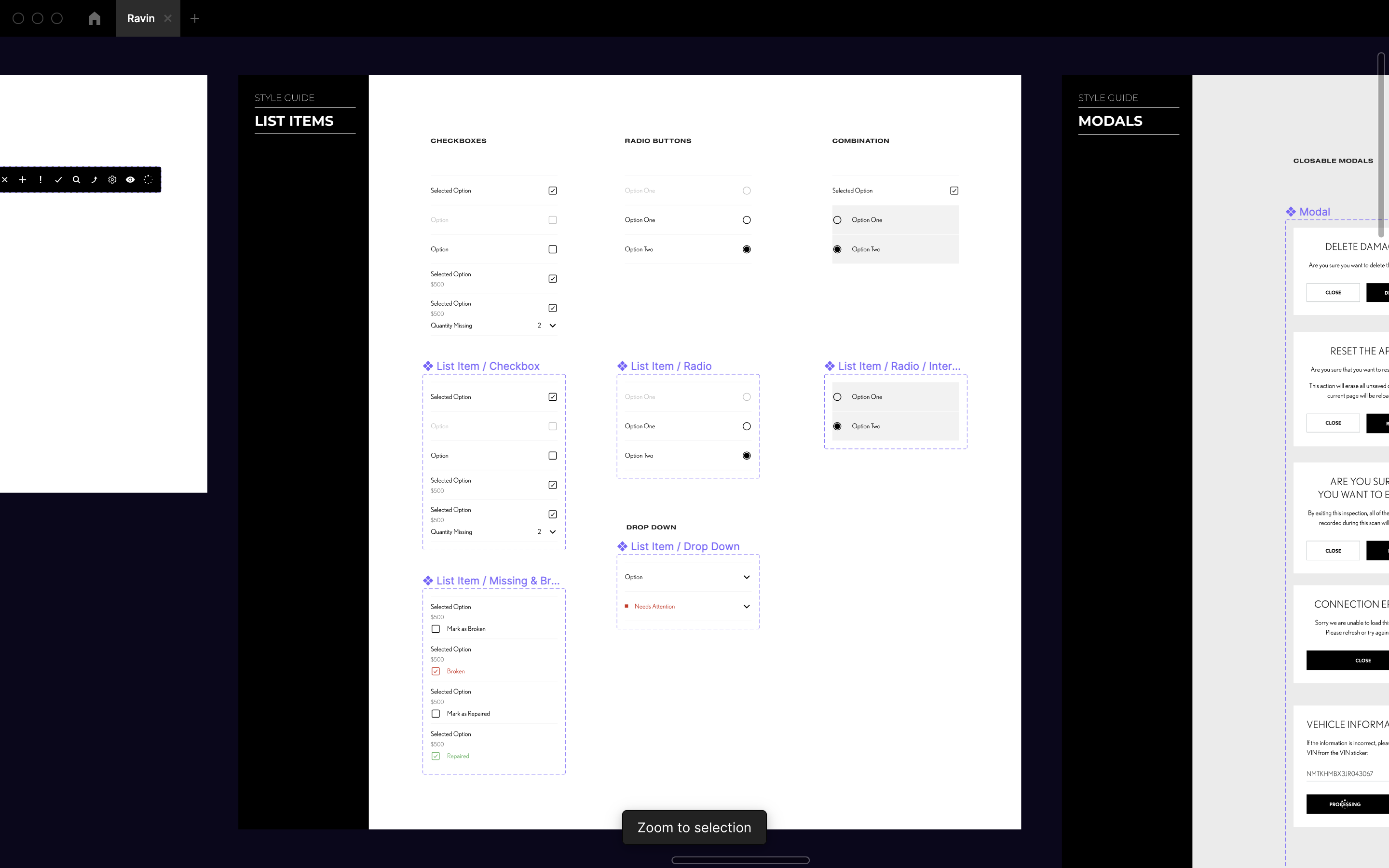
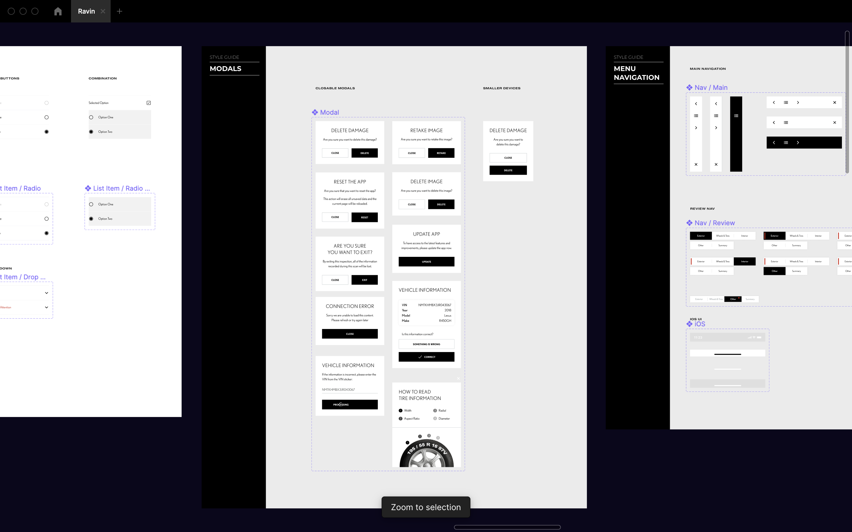
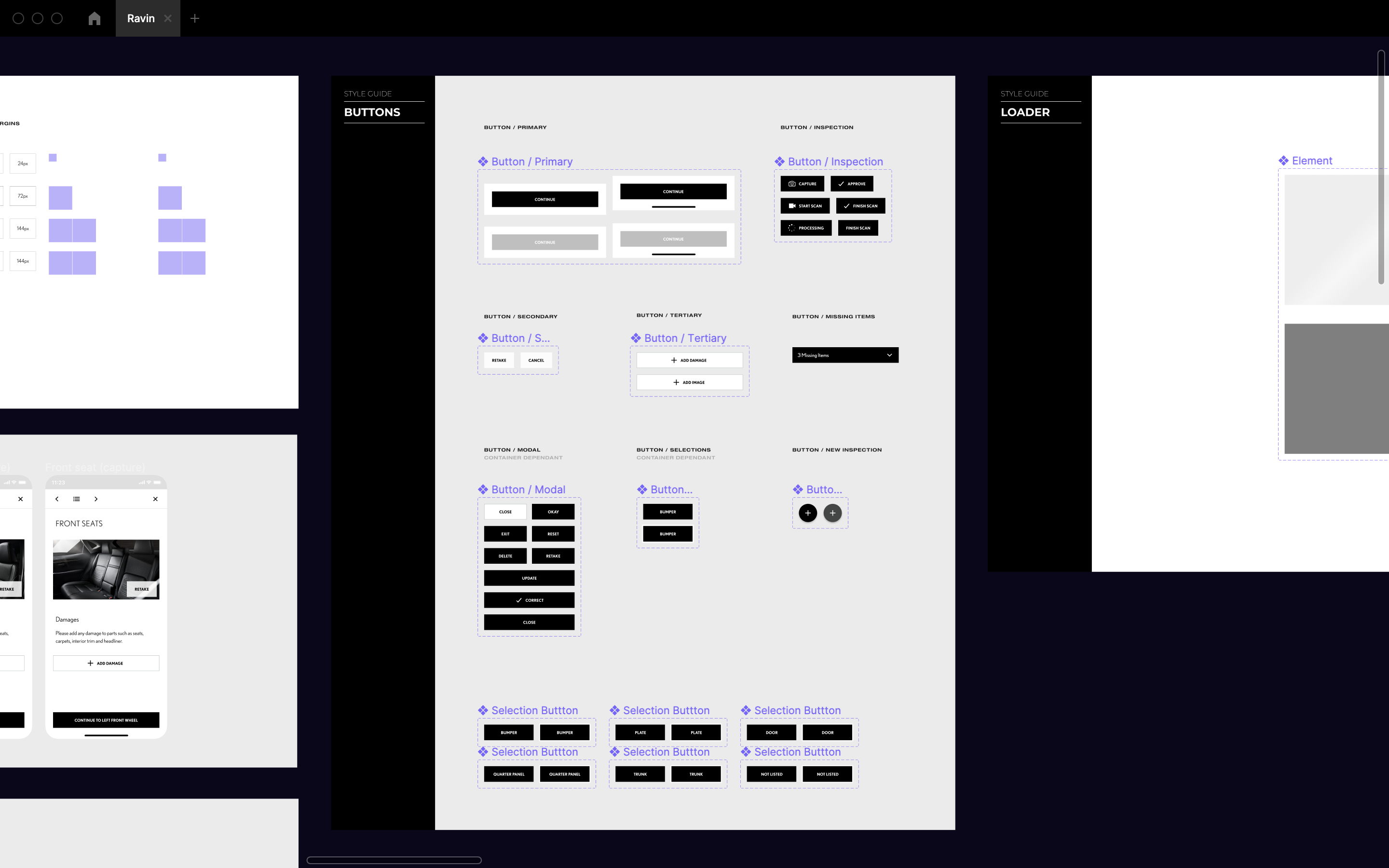
We componentized all design system UI elements to ensure all future designs were clean and cohesive.
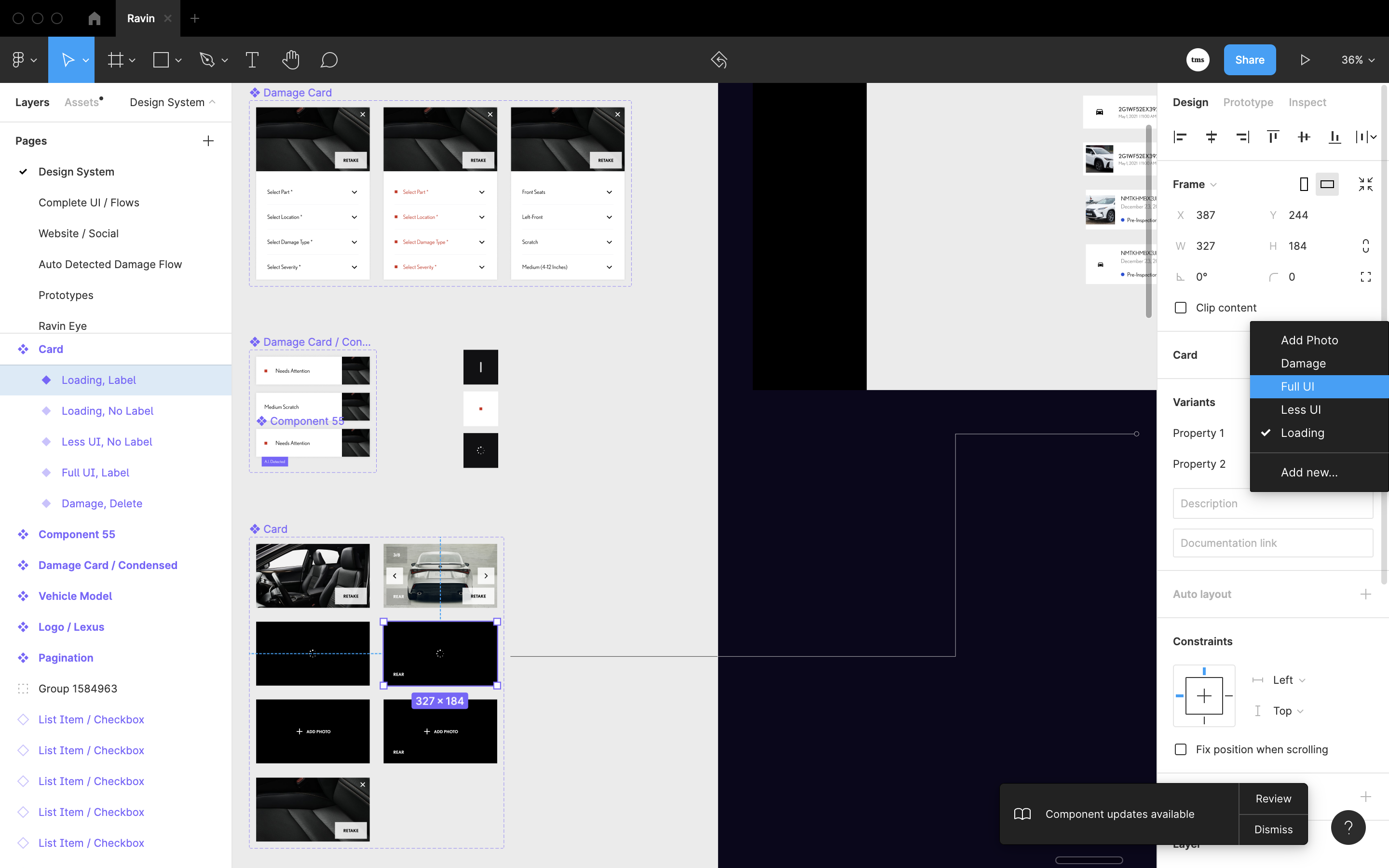
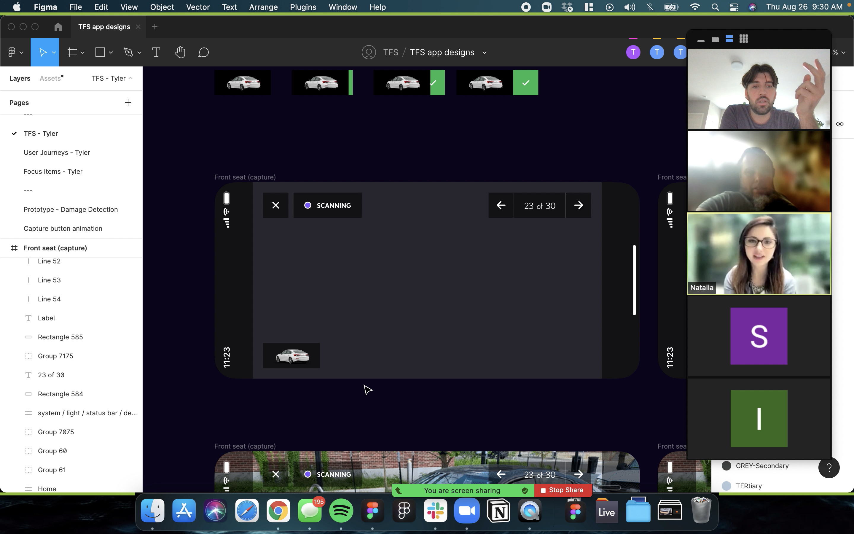
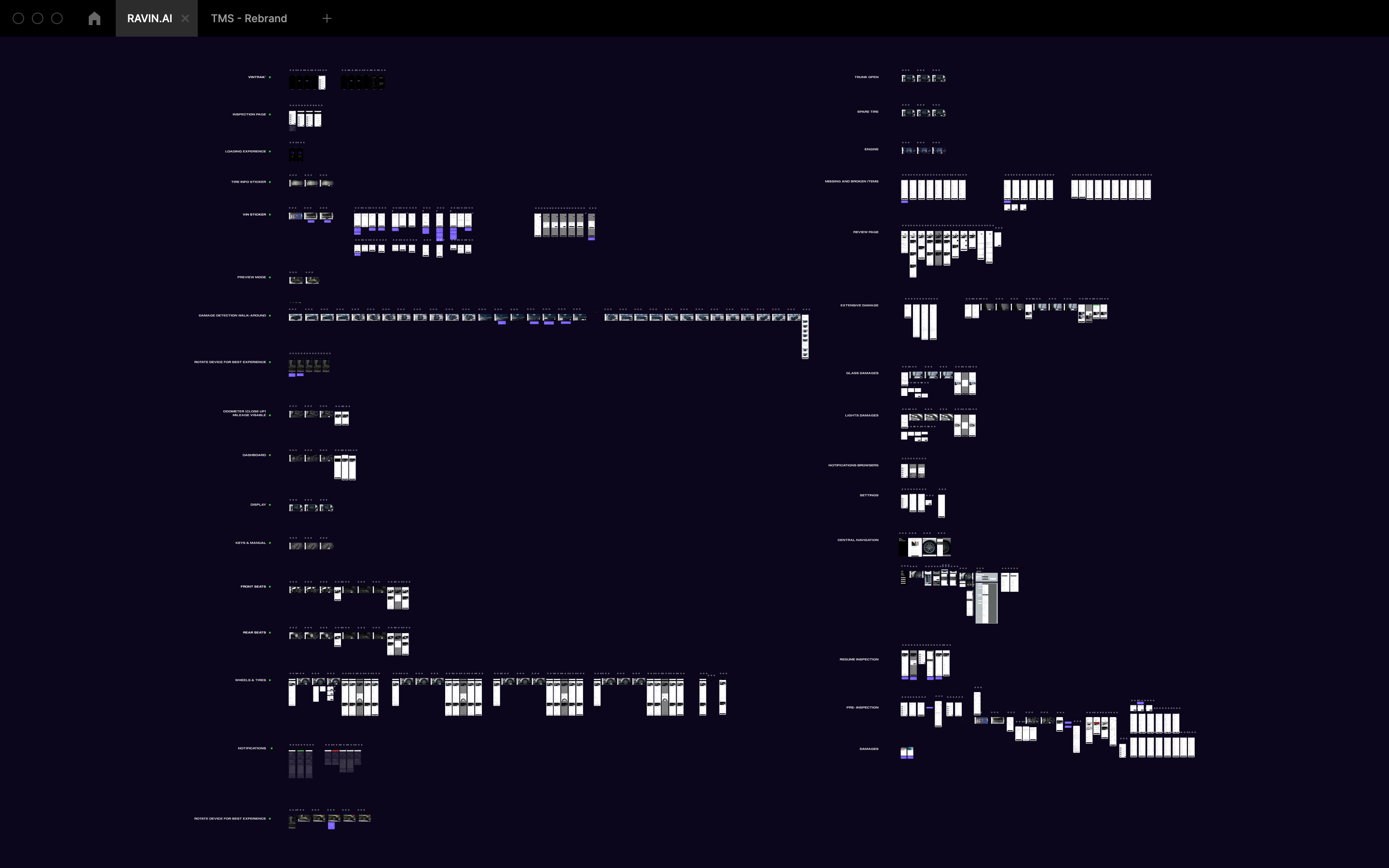
We created a comprehensive design file in Figma to consolidate our updated user flows for the mobile inspection app. This approach ensured consistency and clarity throughout the redesign process, providing a single source of truth. It facilitated seamless collaboration across teams, allowing for rapid iterations based on feedback and ensuring the final product was both user-friendly and visually aligned with our brand.
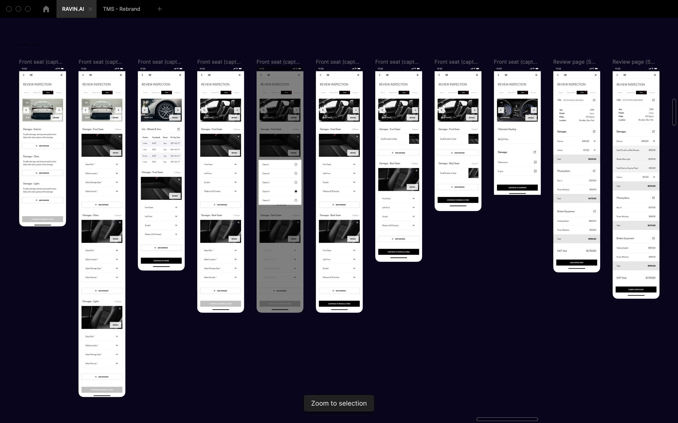
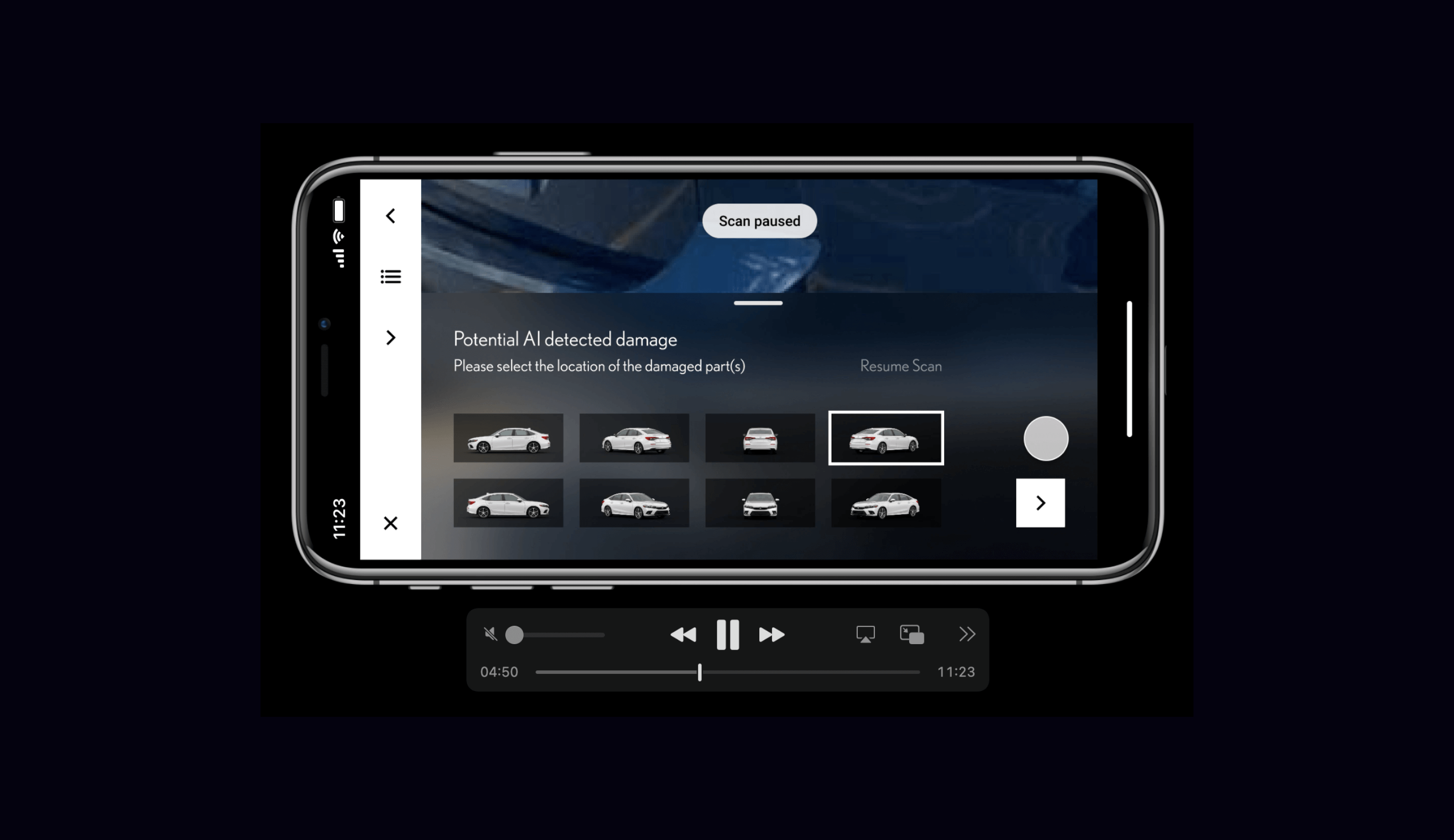
We created prototypes for our AI auto-detecting damage flows to test with users, ensuring they understood the complexity of the process. These sessions were conducted at the dealership level with individuals who inspected the vehicles. By gathering feedback from real users in the field, we were able to refine our designs and ensure that the flow was intuitive and easy to follow. This hands-on testing was crucial in validating our approach and making necessary adjustments to enhance usability.
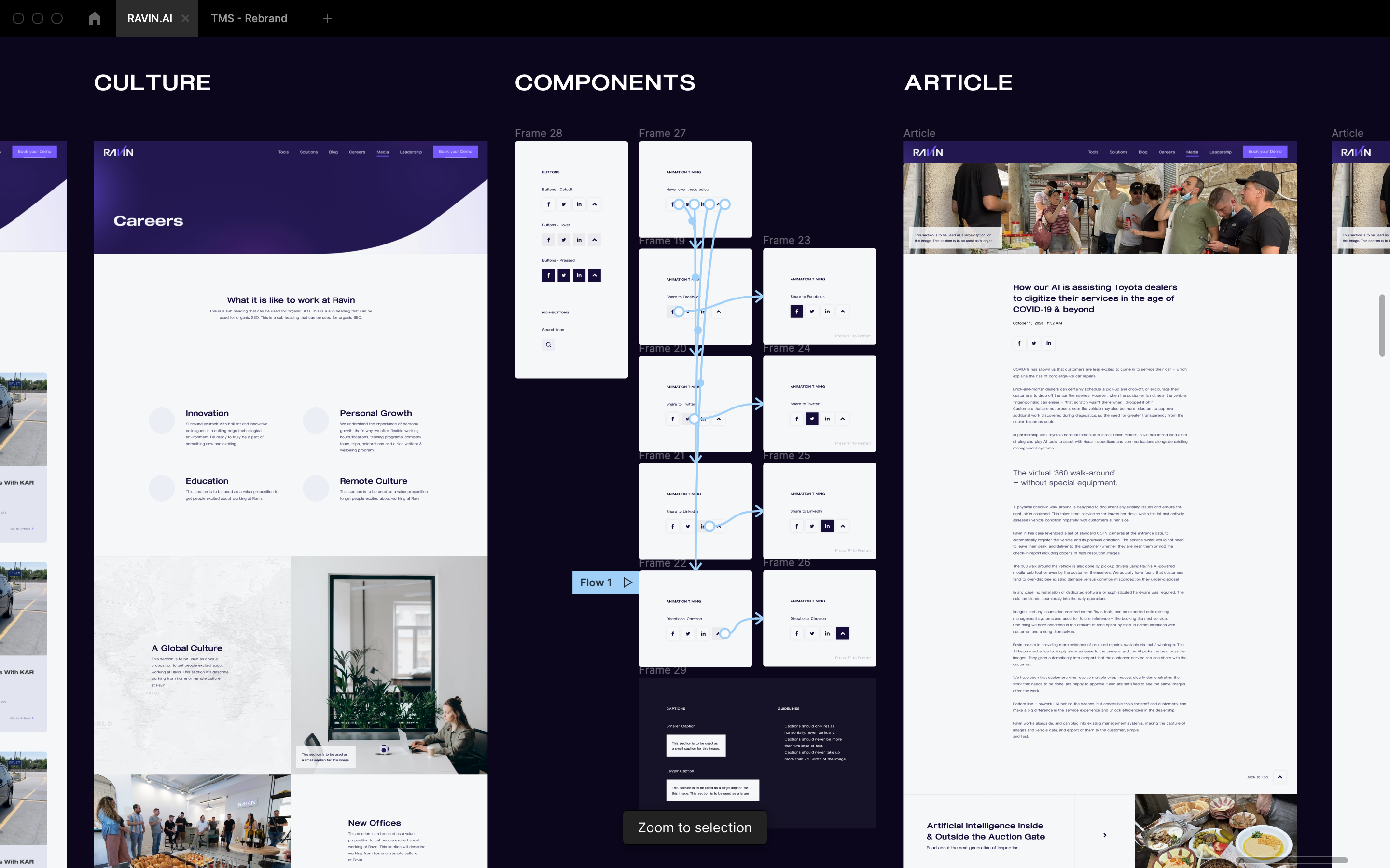
As part of my OKRs, I focused on enhancing our marketing materials and updating our marketing website. The specific OKR was to "Improve website engagement by 20% through updated and new content by Q2." I worked on creating and updating various pages, including several blog posts, ensuring they were visually appealing, user-friendly, and aligned with our brand messaging.
To measure user engagement, we tracked metrics such as time spent on page, bounce rate, click-through rate (CTR), and the number of shares and comments on blog posts. This involved collaborating closely with the marketing team to ensure all content met our strategic goals and resonated with our target audience.
I was then tasked with the V1 redesign of the back-end tool, RavinEye. We updated the visual language to match our front-end consumer-facing mobile inspection app, ensuring brand consistency across all platforms. I also prototyped extensive flows to ensure daily actions could still be achieved seamlessly and that no designs were too far from the current state, preventing confusion for internal teams. This involved close collaboration with key stakeholders and end-users to gather feedback and iterate on the designs. We conducted usability testing sessions to validate the new workflows and made necessary adjustments to enhance usability and efficiency.
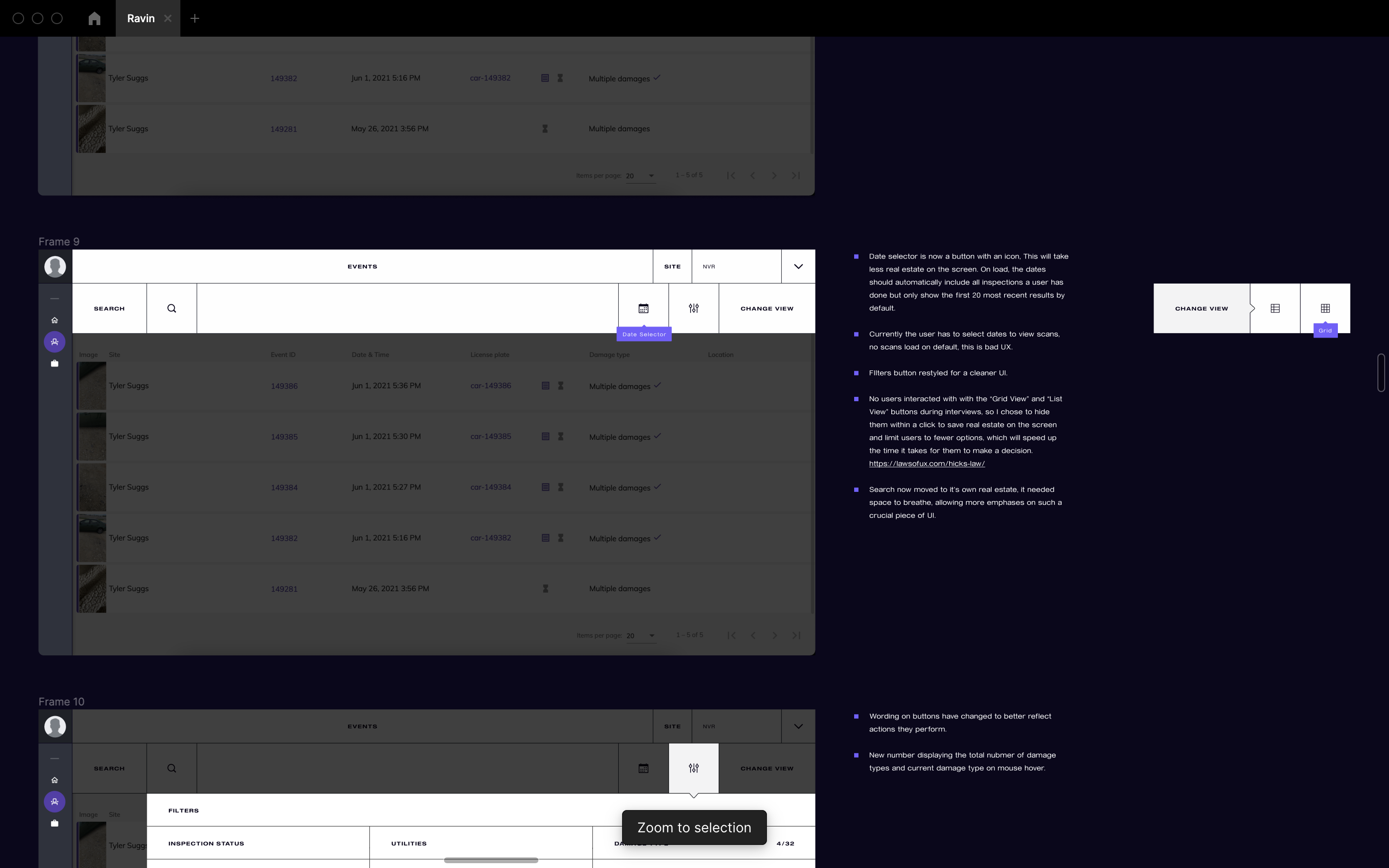
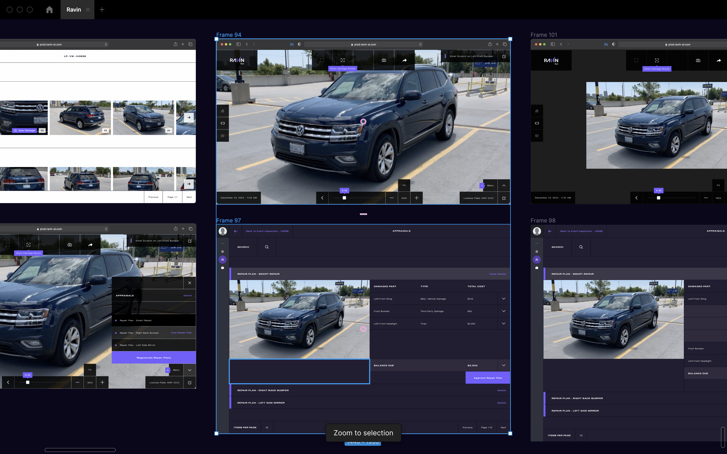
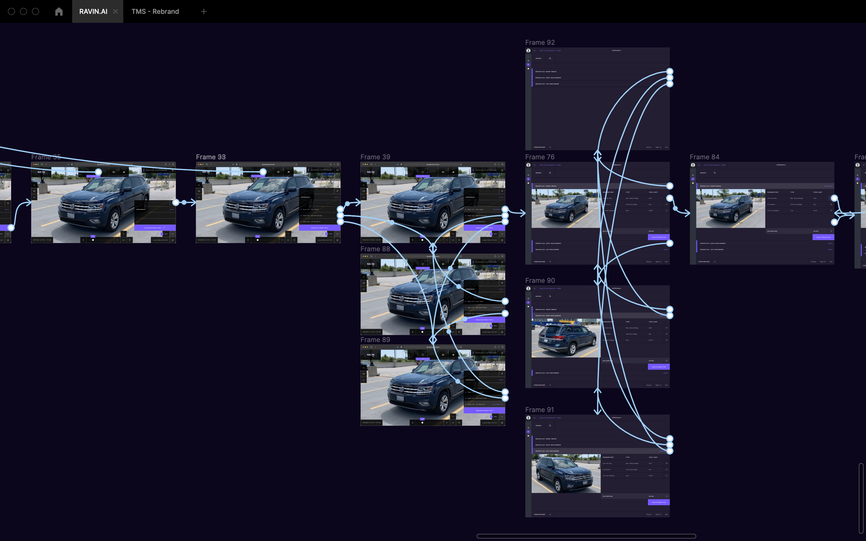
I conducted additional internal interviews to pitch design solutions to department heads responsible for implementation. We sought their expertise and knowledge to assess feasibility and refine our ideas. The design decisions often hinged on the AI's performance, which was initially slow as it was in its learning phase, absorbing inputs and actions from our users. These discussions were crucial in aligning our design approach with practical considerations and ensuring that our solutions were both innovative and implementable.
