COLLINS
AEROSPACE
YEAR
2019
CLIENT
Collins
Aerospace
ROLE
UI/UX
Designer
TASK
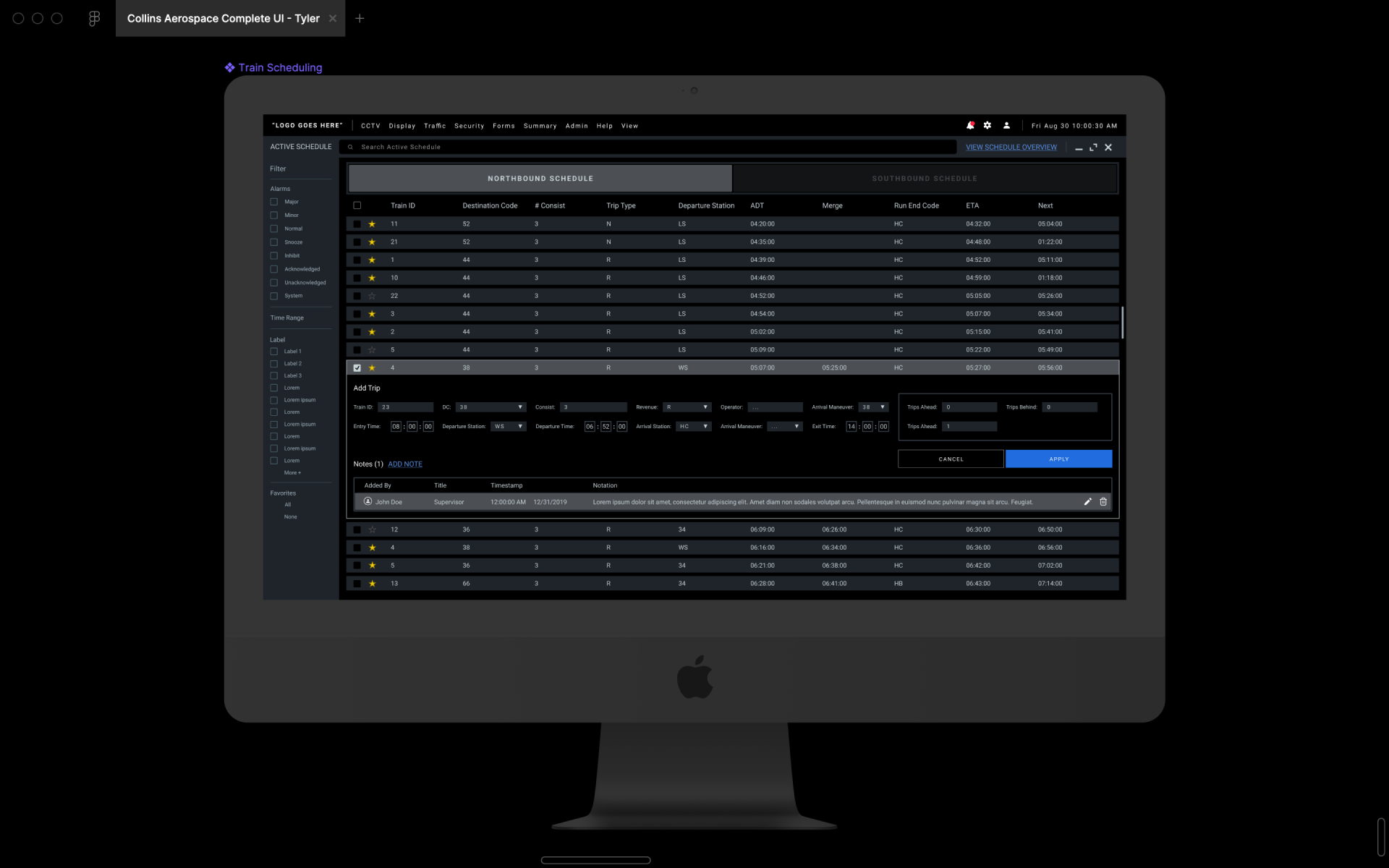
Redesign the Collins Aerospace Septa Railway UI/UX. Help the engineers by creating a better UX
PROJECT DESCRIPTON
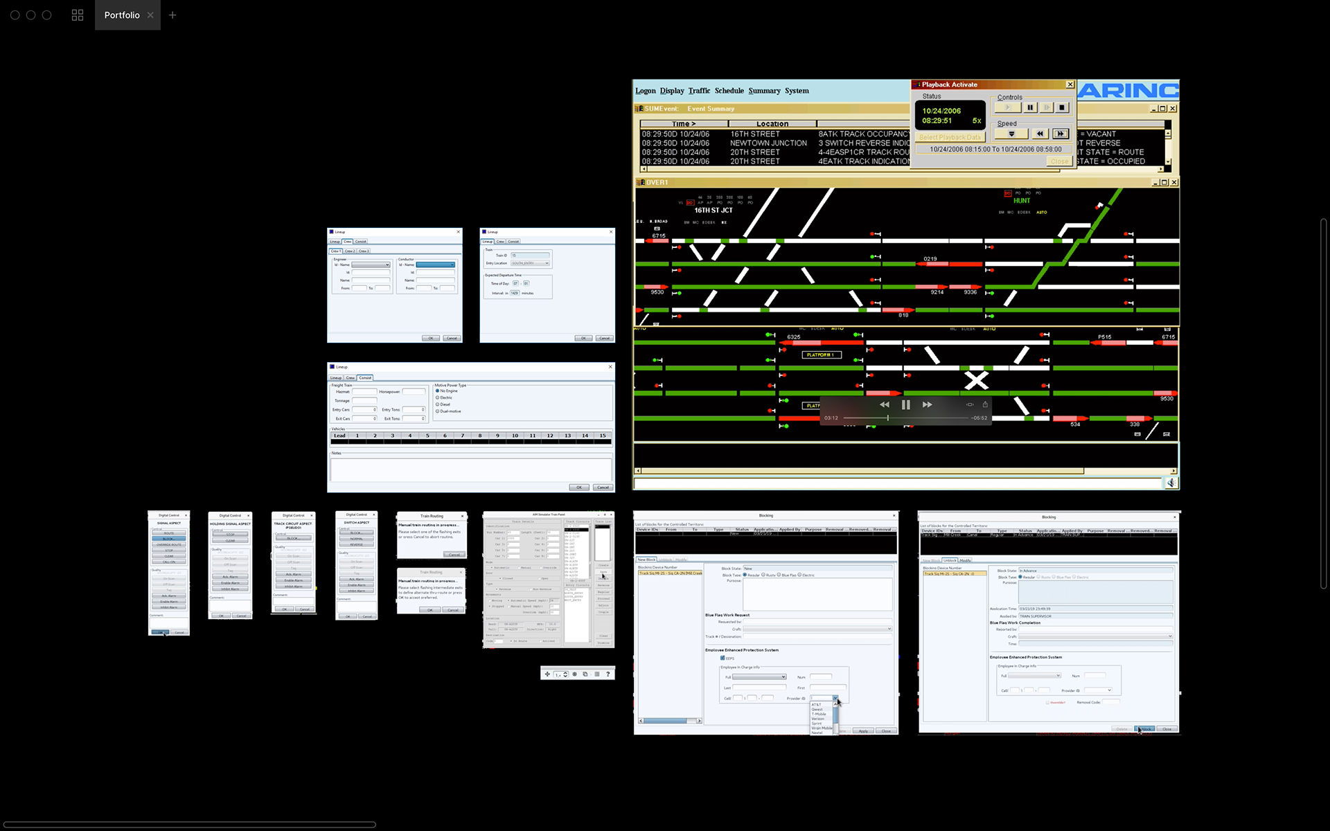
Responsible for the redesign of the Collins Aerospace Septa Railway UI/UX. The old design was outdated and extremely difficult to digest from a user standpoint. This client was remote, thus tri-weekly meetings were conducted with stakeholders, product managers and engineers with status checks on UI and to make sure deadlines were being hit and budget on target.
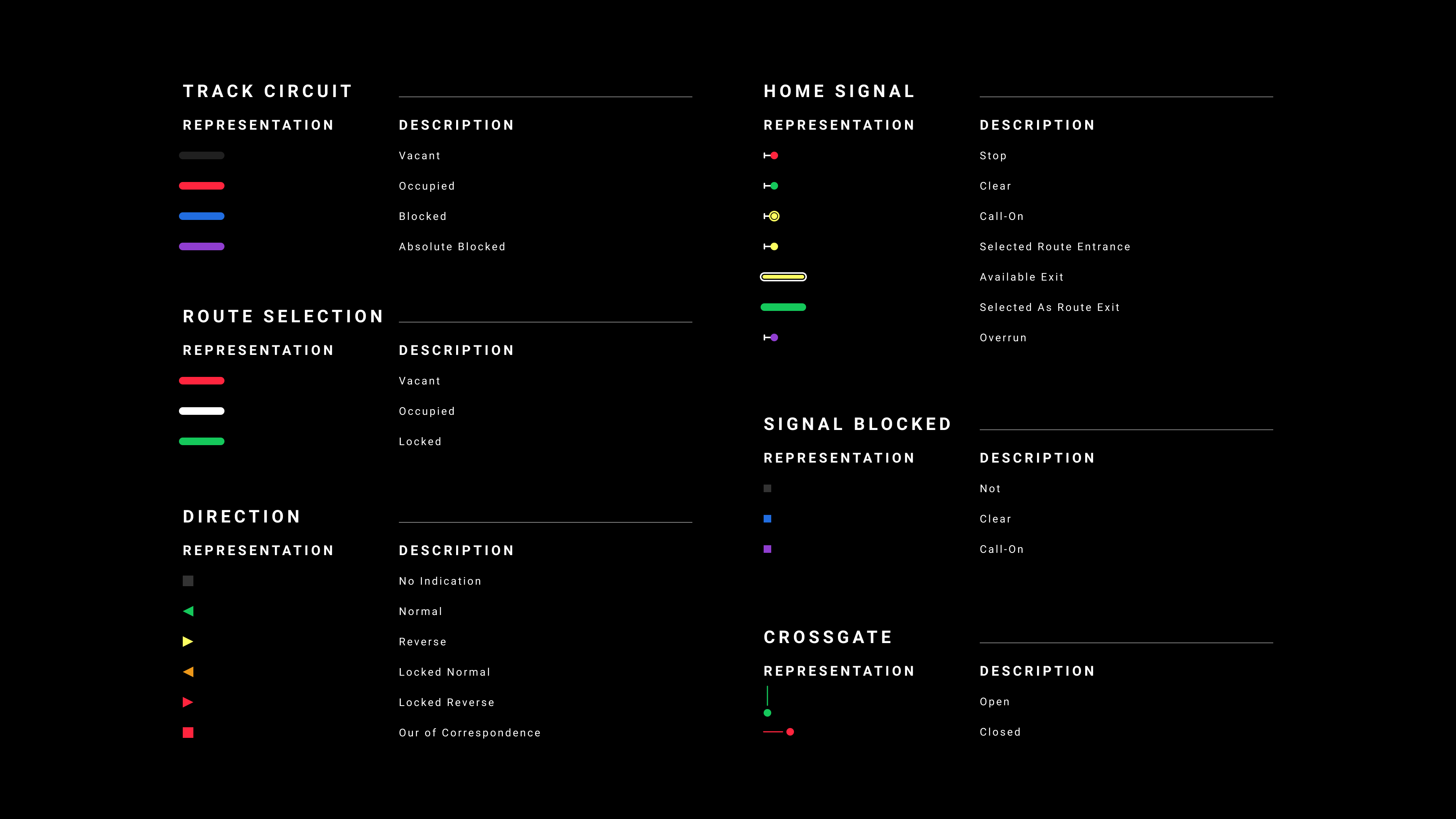
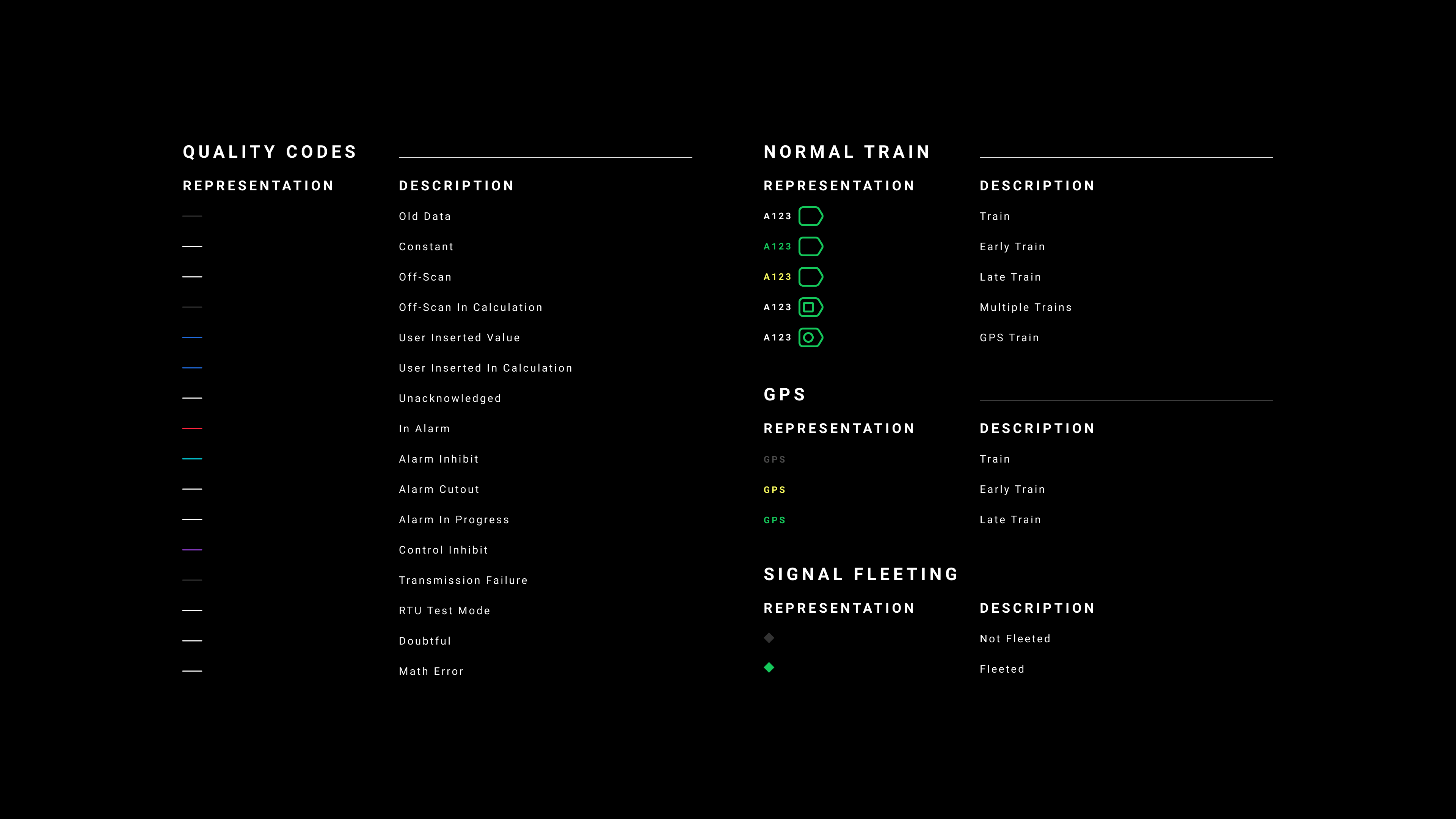
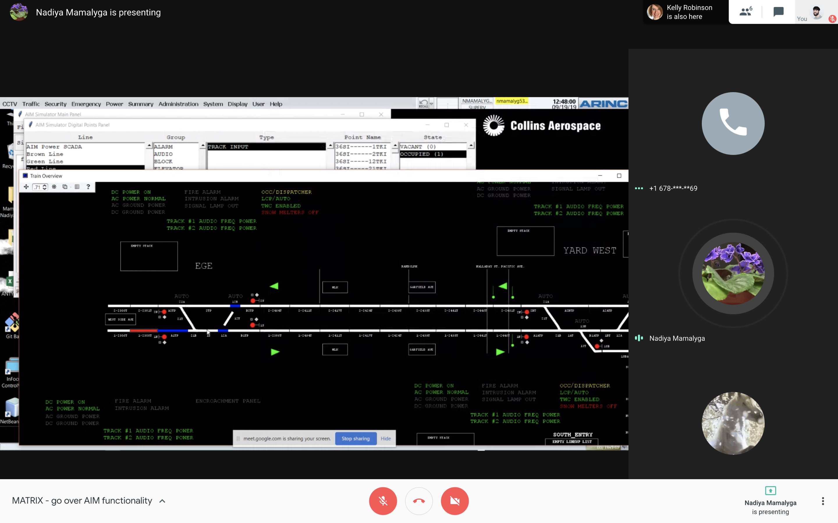
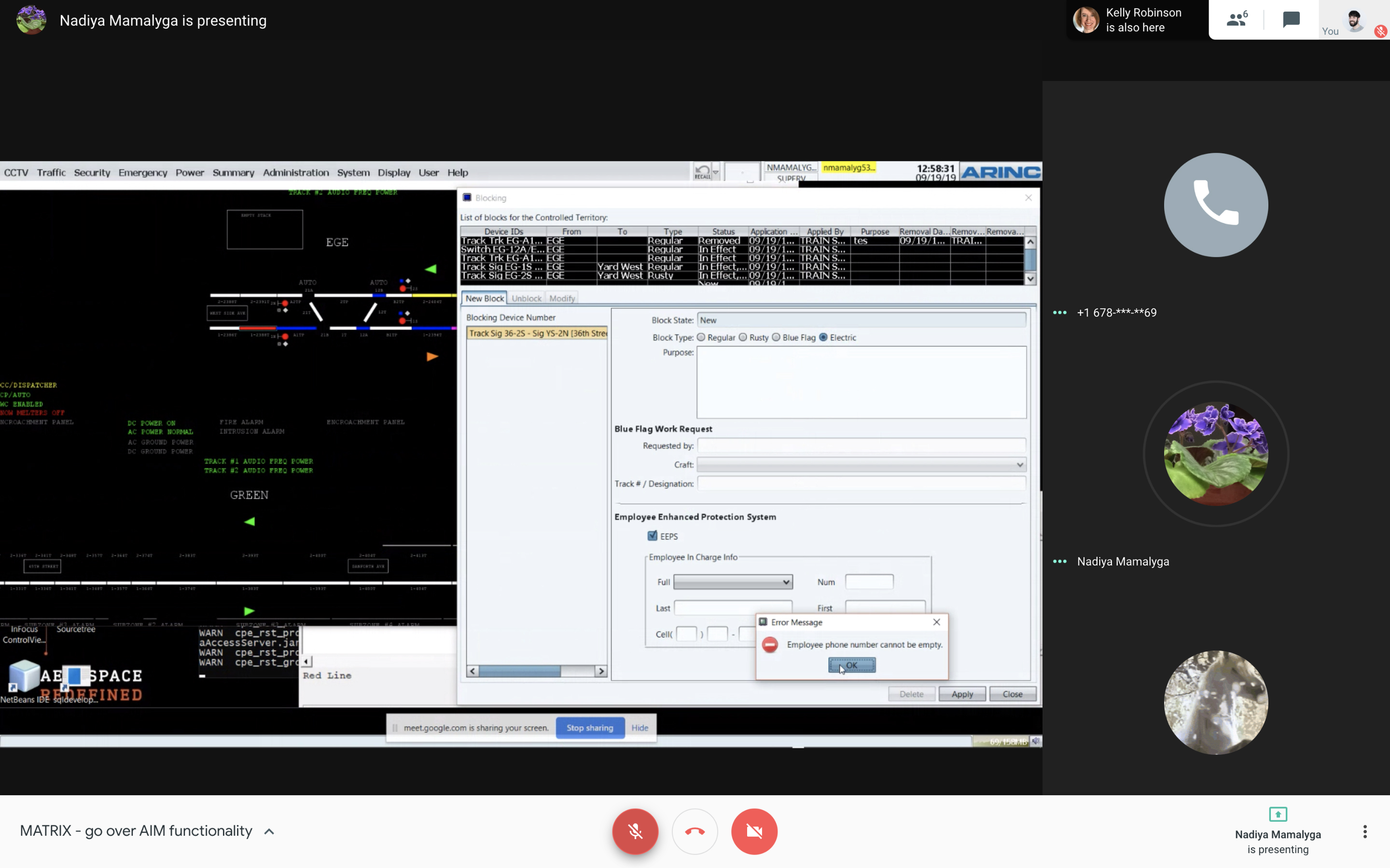
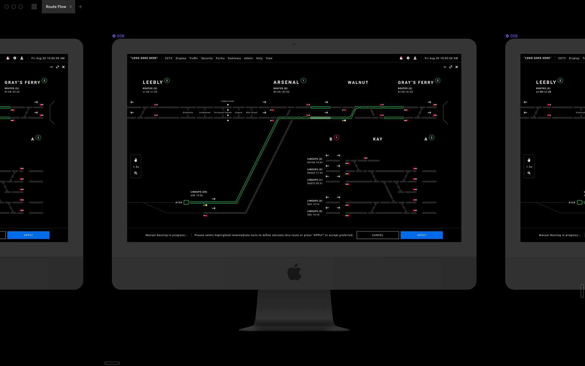
Problems with the UI were the constant flashing of many different pieces of UI, colors that were too bright for the dark control room the users were stationed in and lastly a poor hierarchical structure of elements in design interface. The goal of the project was to present the client with a UI that could breathe, a UI that the conductors, supervisors and above could all still relate to and understand while giving them a new fun and interactive UI.
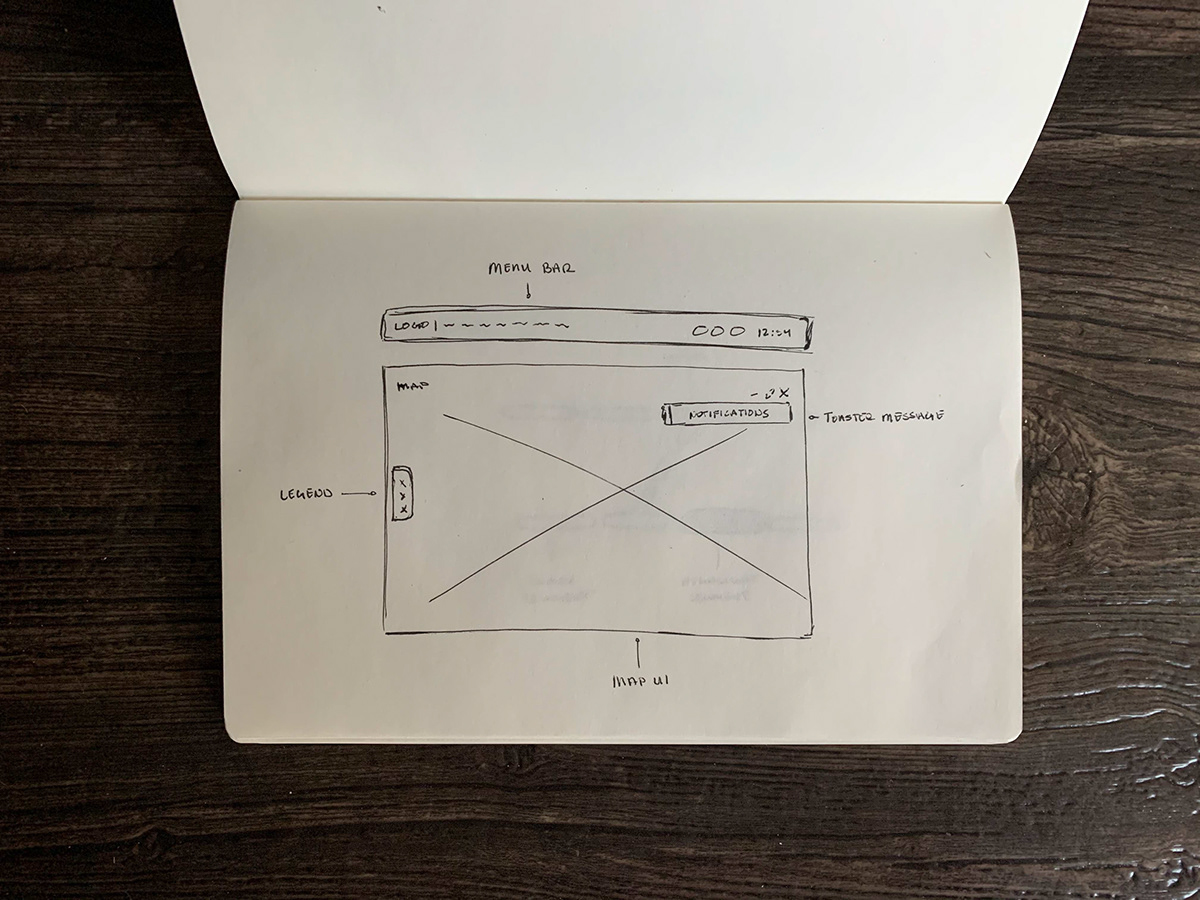
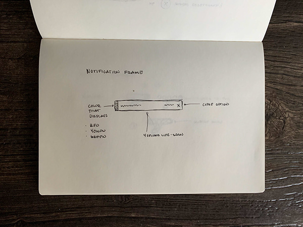
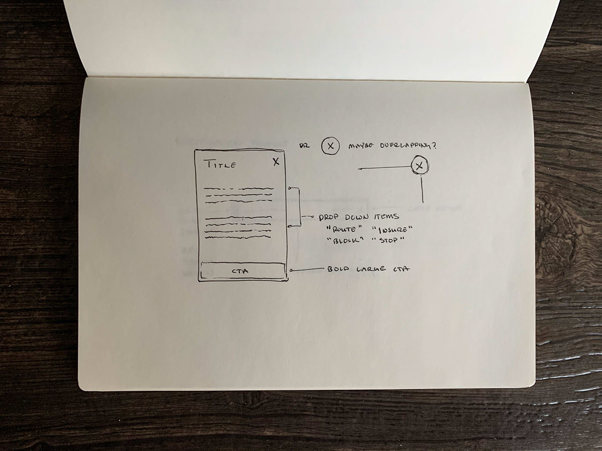
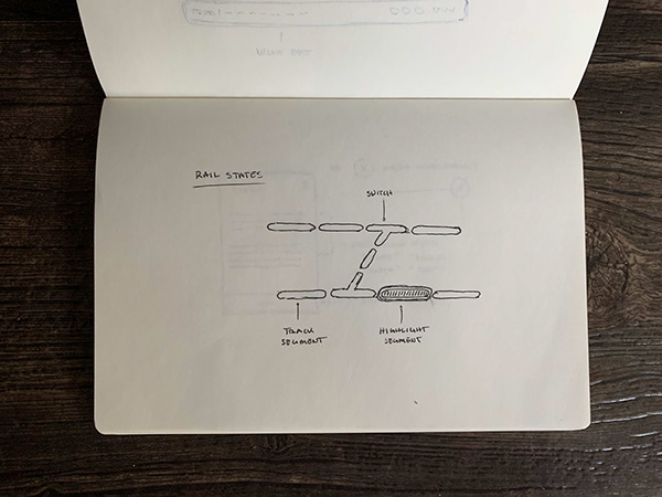
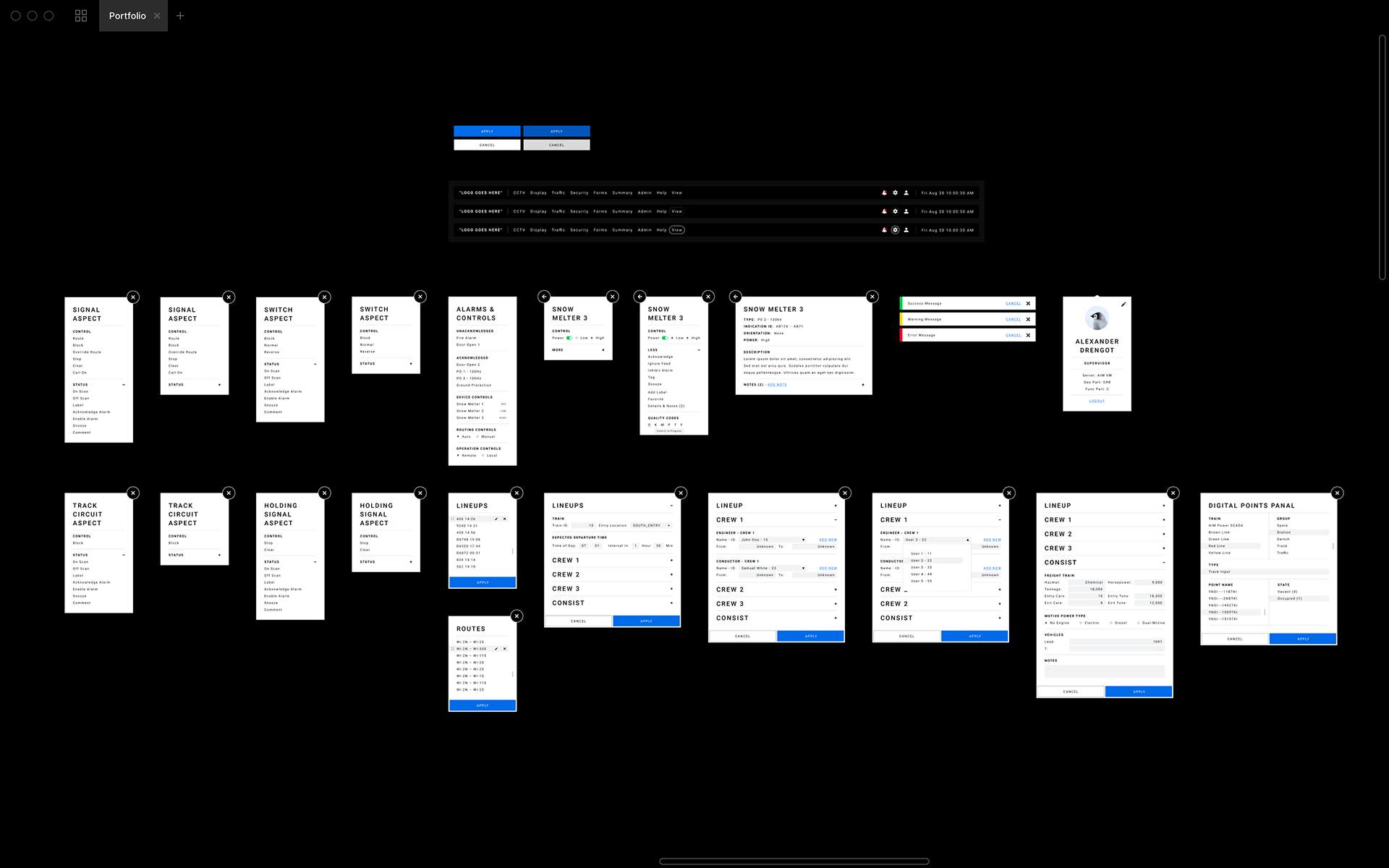
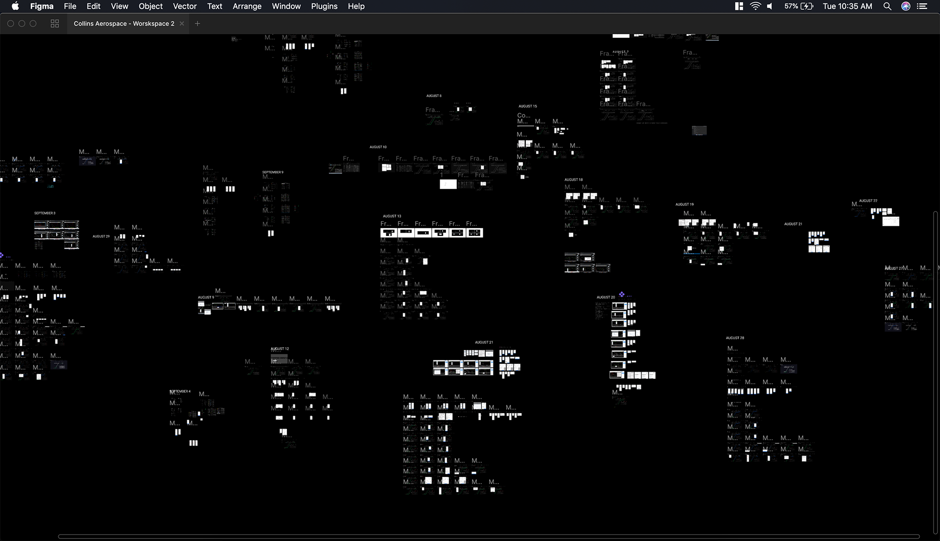
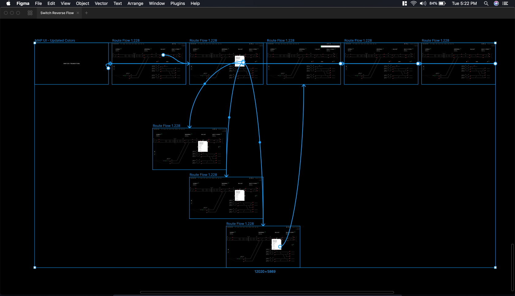
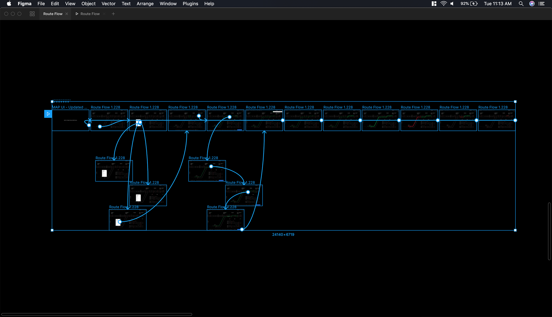
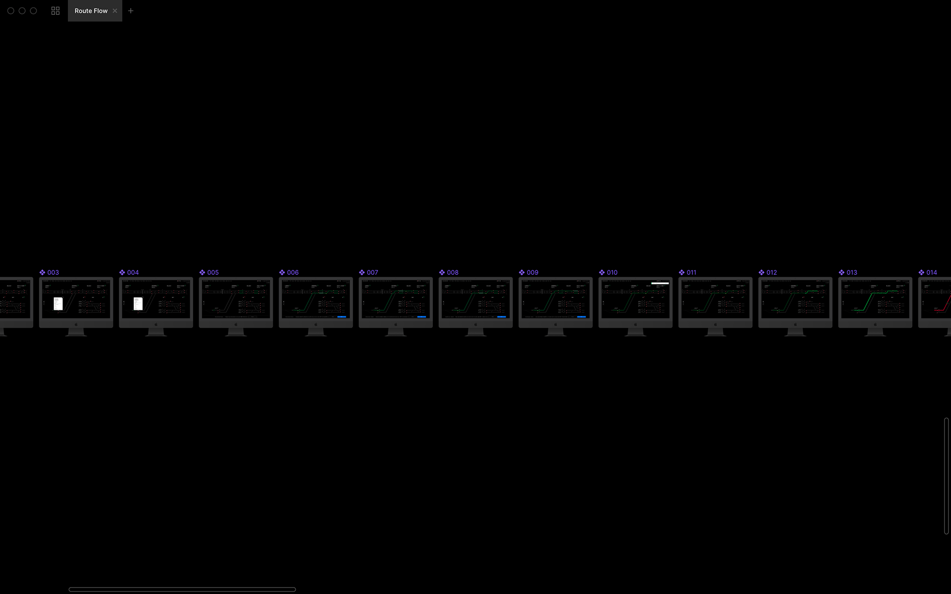
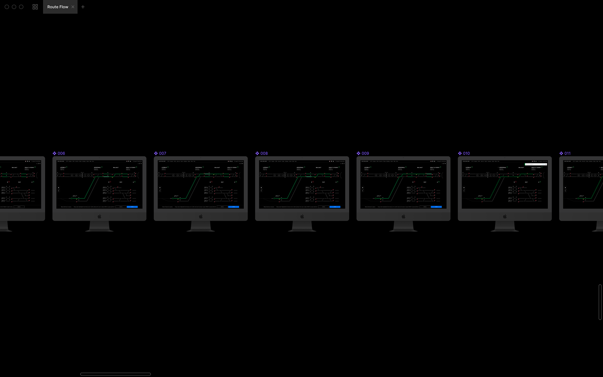
In order to give an accurate representation of how the product would preform, my team was tasked with the creation of wires to wireflows, wireflows to mockups, mockups to animated prototypes then would share our Figma files that were completely polished, only showing pertinent frames, etc over to dev after approval.
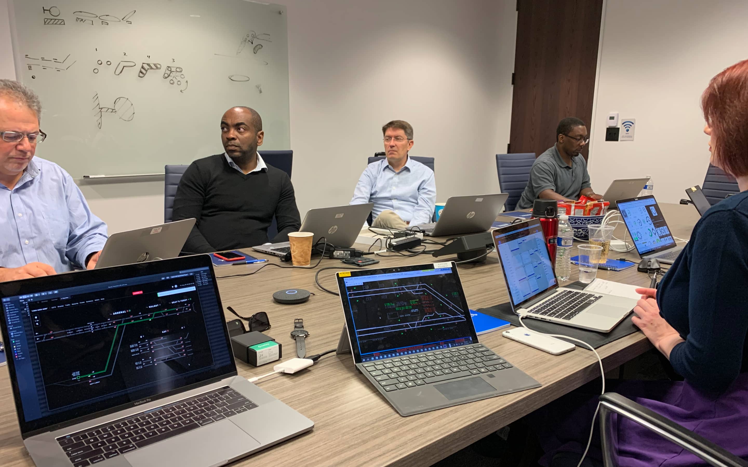
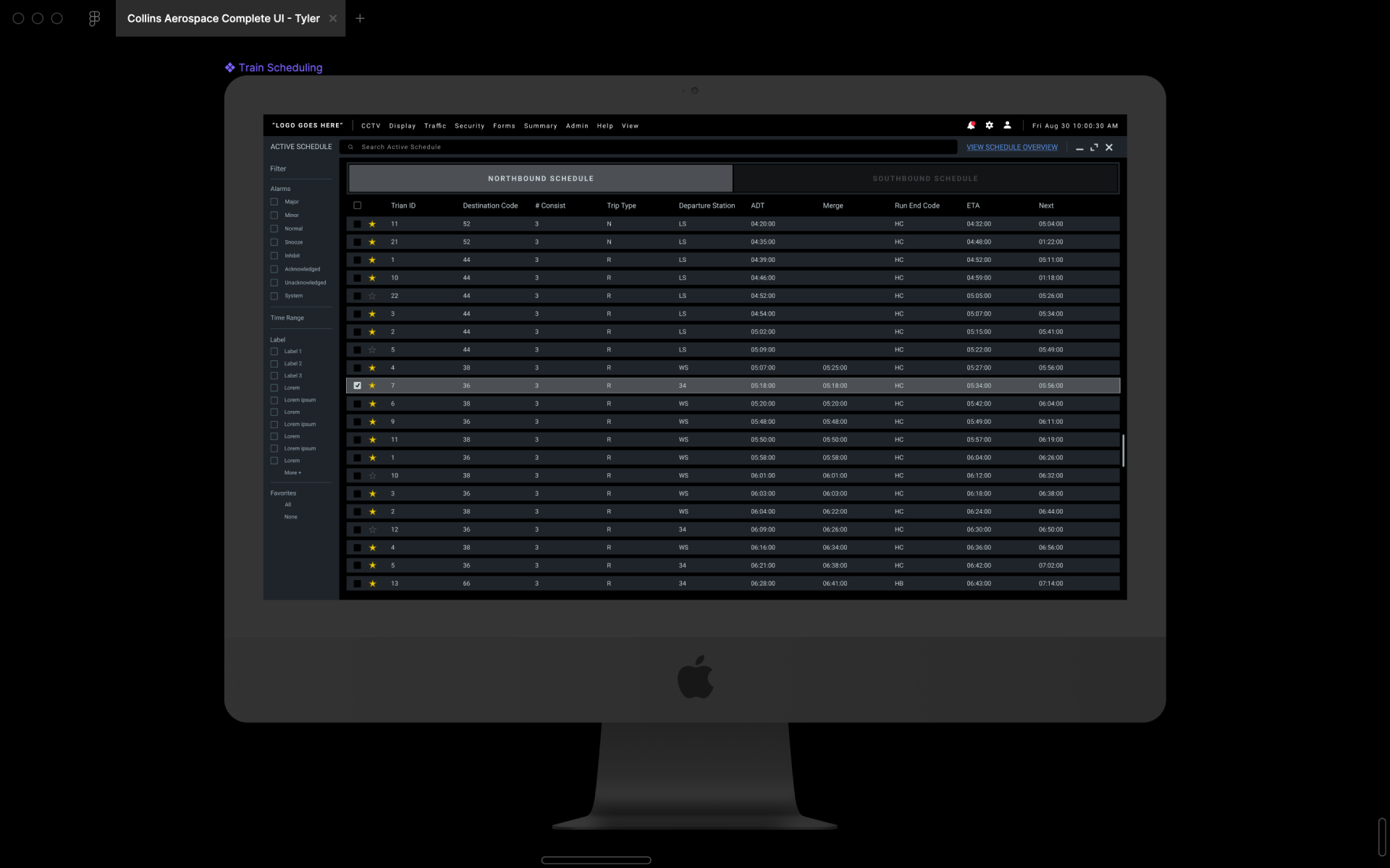
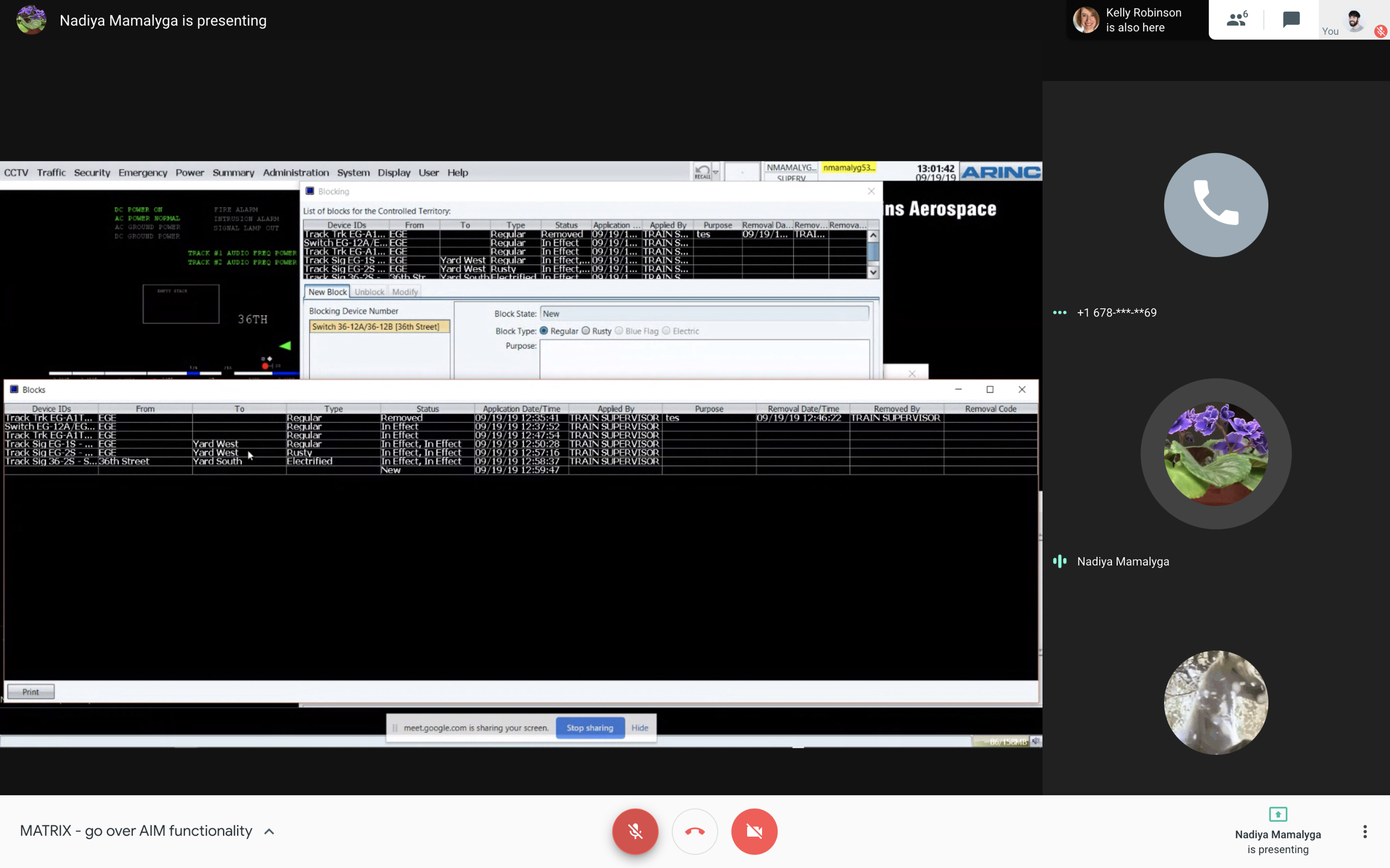
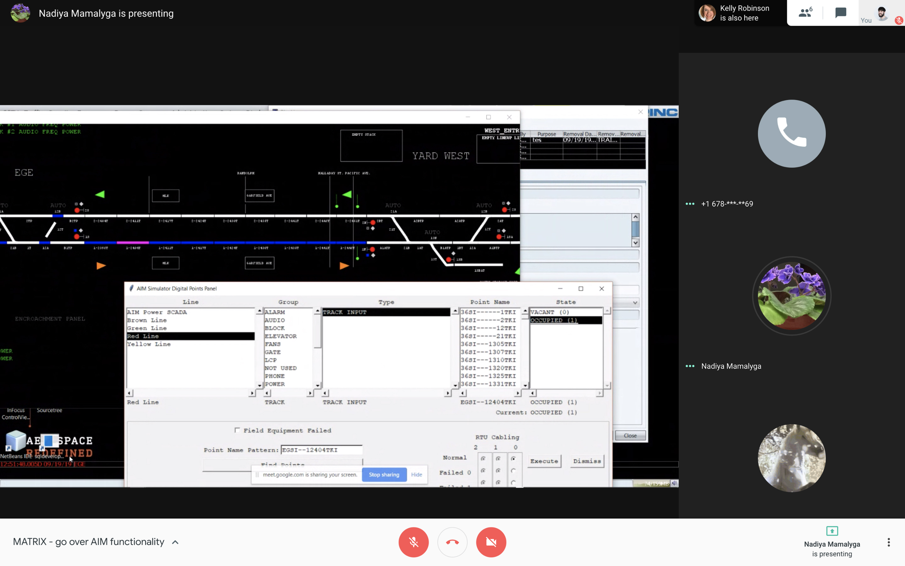
Product is used internally with strict security restrictions and cannot be linked. Since then they have been aquired but Wabtech. That being said, below is a link to the company that acquired them as well as screenshots of the product being used in real life.
wabtechcorp.com
